Wednesday 28th of April 2021
was the day I finally saw the coast again. The getaway was a result of being introduced to the Folkestone Triennial during a lecture at Middlesex University. It was the impression of a colourful place of art that drew my attention towards it, and my growing urge to be near the coast again that transferred this urge into reality.
was the day I finally saw the coast again. The getaway was a result of being introduced to the Folkestone Triennial during a lecture at Middlesex University. It was the impression of a colourful place of art that drew my attention towards it, and my growing urge to be near the coast again that transferred this urge into reality.
I do not only refer to myself as ‘a landscape person’ but also as ‘a coast person’. Up until last September, I had lived my whole life by the coast, mainly on the west coast of Norway before moving to the north-eastern coast of Scotland in 2015. While I was developing a Woodcut last year – a portrait of my maternal grandfather depicted as the fisherman and seafarer he was – it became clear to me that this addiction of being close to the coast runs deeper than simply through my veins. It is in my DNA, inherited from generations of coast people who equally needed and – needless to say, more than I – depended on it to simply survive.
I love living in London, but the strict rules of the Lockdown provided meaning to the notion of ‘isolated’, therefore, I could not think of a better way to celebrate my birthday than by the coast, in a little charming cottage in the equally charming village of Hythe
(image to the right) – in safe walking distance
to my initial attraction, Folkestone.

‘Why walking distance?’
you may say,
when there are buses, cars even bicycles that could transport me back and forth with comfort in a short time. While some may refer to themselves as ‘walking artists’
– and I do relate my own way of working to their practice,
I familiarise more with the landscape artists,
though a wanderer in the landscape.
Further, I describe my process as
being present while being active
and emphasise the term topography
which lends its description to my work as ‘the study of
the forms and features of land surfaces’.
A printmaker’s very focus is often
‘surface’ and the process of documenting
in order to convey it through imprints.
The term Topography may provide broader meaning to my recent prints that I refer to as maps, created during the process of walking in – combined with interpretation of – the landscape, further referred to as mapping.
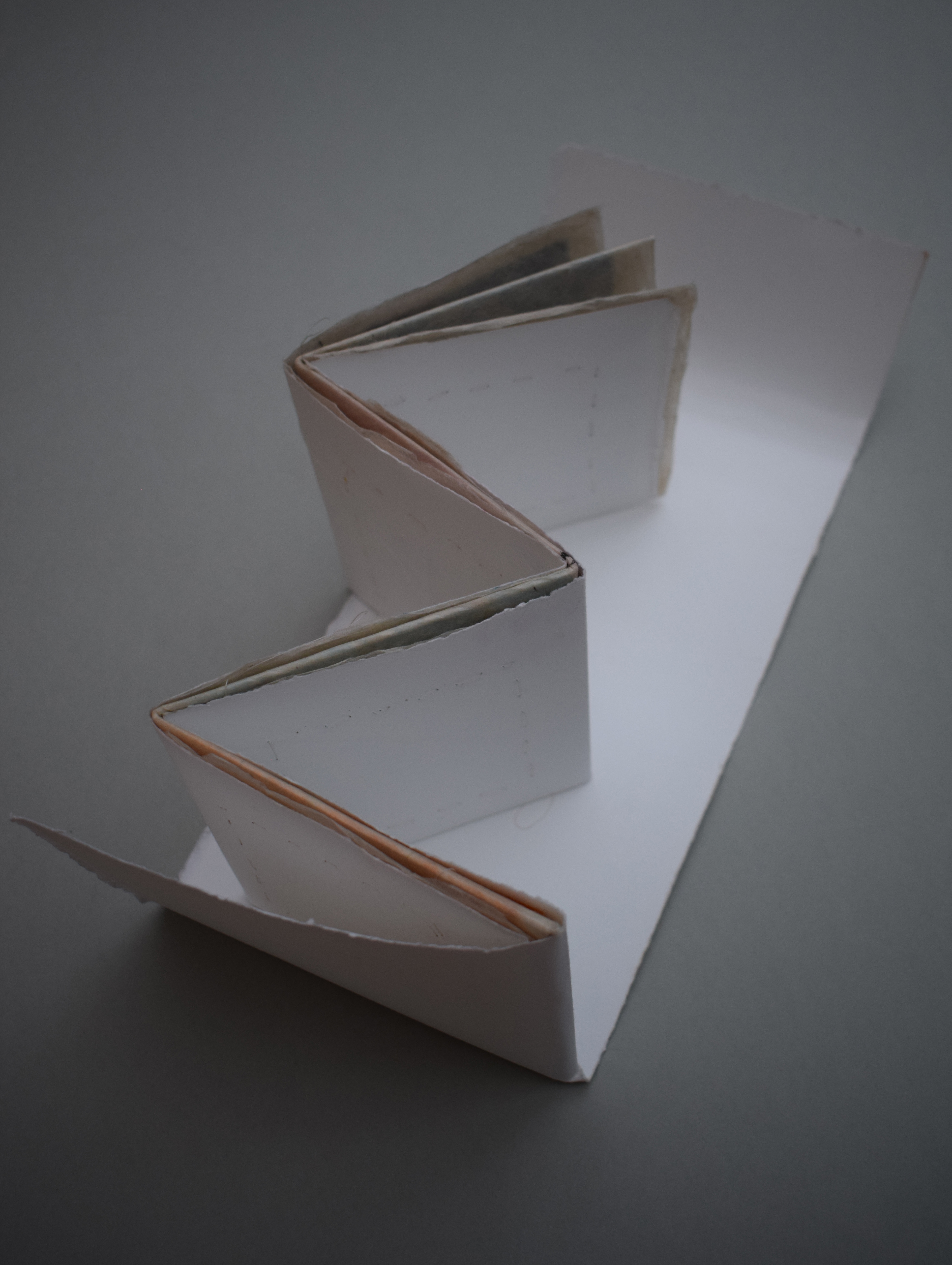
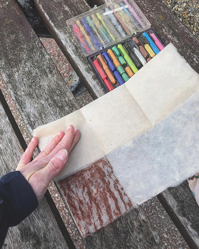
Frottage maps
I have developed ‘frottage maps’ (image above to the left) during ‘frottage walks’ (image to the right)
as a result of the challenges linked to documenting objects that were static in the landscape – meaning I could not pick them up and bring them with me home to create imprints – as opposed to the found objects I collect during walks. Therefore, I had to bring the maps – sheets of paper
folded into smaller squares to replicate folded maps –
with me, out into the landscape I aimed to depict.
Because of the travel restrictions, I had up until now worked within a short radius of where I live in North London. A growing fascination related to the history of the area – in particular, that of Hampstead Garden Suburb
and its founder Henrietta Barnett –
resulted in a presence of the suburb in all my projects during the first third of my MA.
I brought paper and colours to the coast
and embarked on a coastal frottage walk.
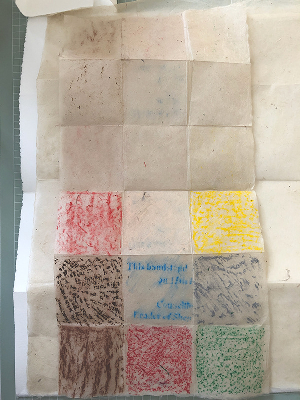
The easing of restrictions meant that the coast is now present in one of my maps. While having referred to the working title Coastal Frottage Walk,
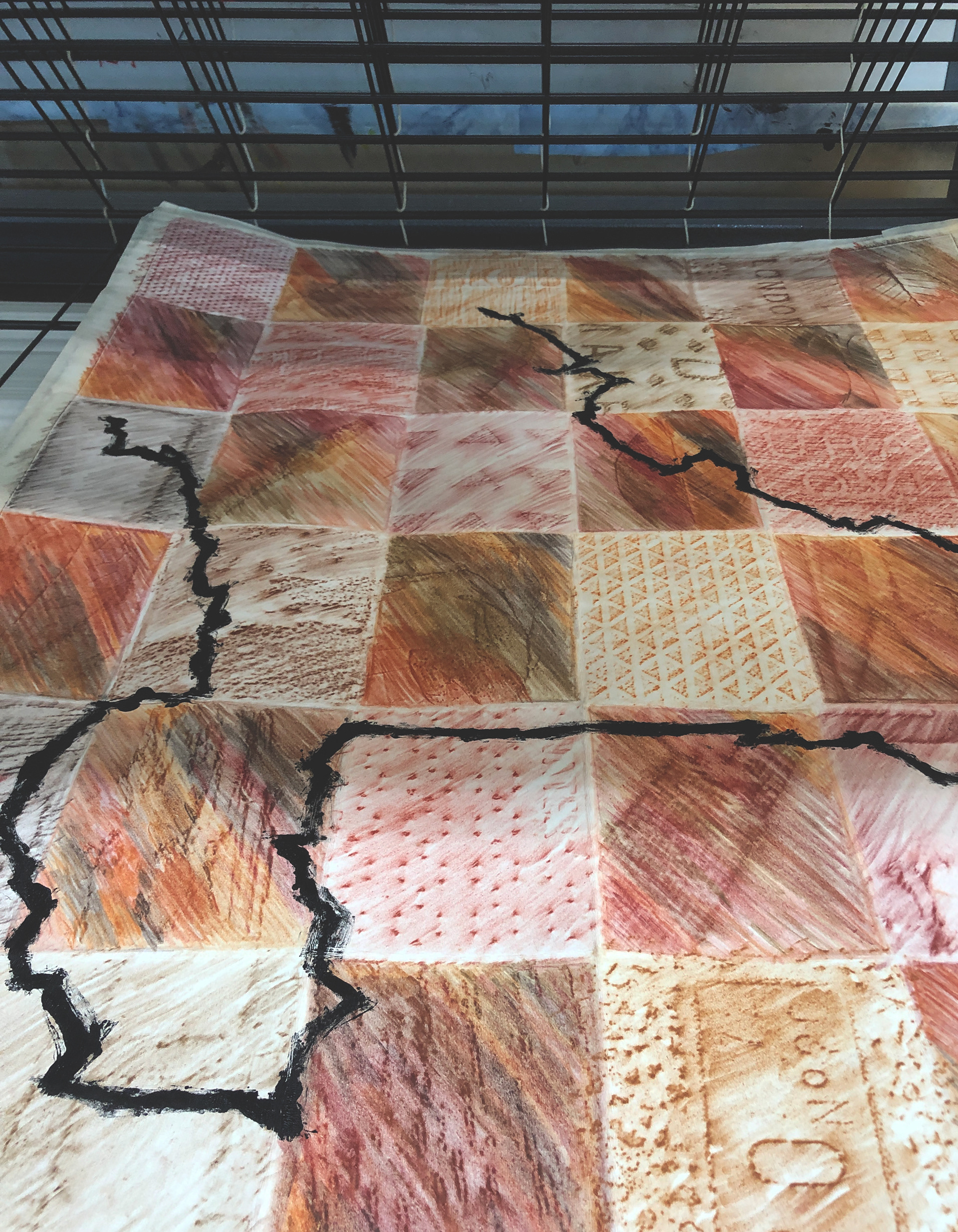
the finished piece will be titled ‘This Bandstand’, relating to one of its squares – a frottage print of the Leas Bandstand from 1895 (image to the right).
This square is one of nine squares
each with a different surface documented
with the use of frottage print,
a technique where you rub the surface of
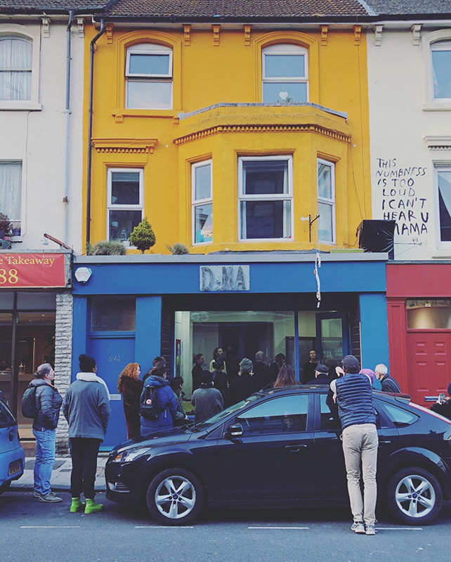
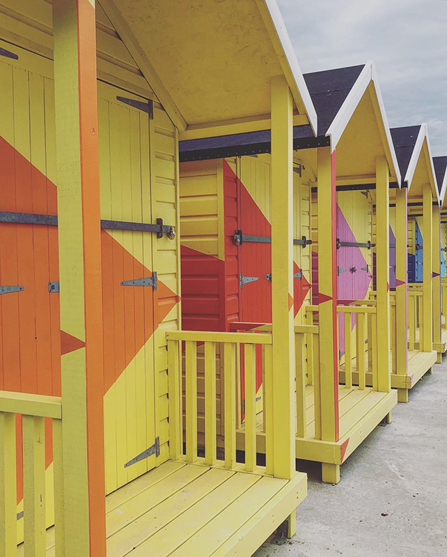
a paper laid onto another surface with e.g. a pencil to evoke and transfer the structure. The surfaces represented in the nine squares range from various static objects including the wooden bench I sat on and from where I both commenced the walk, returned to and subsequently ended the walk (image below left), the weather-worn concrete pavement on the beach walk, H.G.Well’s pistachio coloured house (image below right), Richard Wood’s red hut, Hamish Fulton’s large scale sign showing his myriad of walks, and a bright yellow mine.
The equal size of the squares placed next to each other refuses to construct a hierarchical structure. The squares do not represent artists or inventors, nor builders or labourers, merely constructers of constructions.
and embarked on a coastal frottage walk.
The easing of restrictions meant that the coast is now present in one of my maps. While having referred to the working title Coastal Frottage Walk,
the finished piece will be titled ‘This Bandstand’, relating to one of its squares – a frottage print of the Leas Bandstand from 1895 (image to the right).
This square is one of nine squares
each with a different surface documented
with the use of frottage print,
a technique where you rub the surface of
a paper laid onto another surface with e.g. a pencil to evoke and transfer the structure. The surfaces represented in the nine squares range from various static objects including the wooden bench I sat on and from where I both commenced the walk, returned to and subsequently ended the walk (image below left), the weather-worn concrete pavement on the beach walk, H.G.Well’s pistachio coloured house (image below right), Richard Wood’s red hut, Hamish Fulton’s large scale sign showing his myriad of walks, and a bright yellow mine.
The equal size of the squares placed next to each other refuses to construct a hierarchical structure. The squares do not represent artists or inventors, nor builders or labourers, merely constructers of constructions.

Creative Folkestone
As a result of the paper sheets I previously have worked on being rectangular, the previous maps and squares have also been rectangularly shaped.
Developing the coastal frottage map, I took inspiration from the ‘Creative Folkestone’s’ logo in several ways,
one being the squares, the other being the use of colours. Further, I experimented with the utensils, using Lokta handmade paper in combination with soft- and oil pastels. This resulted in a thin fragile folded construction that proved to be in need of further development.
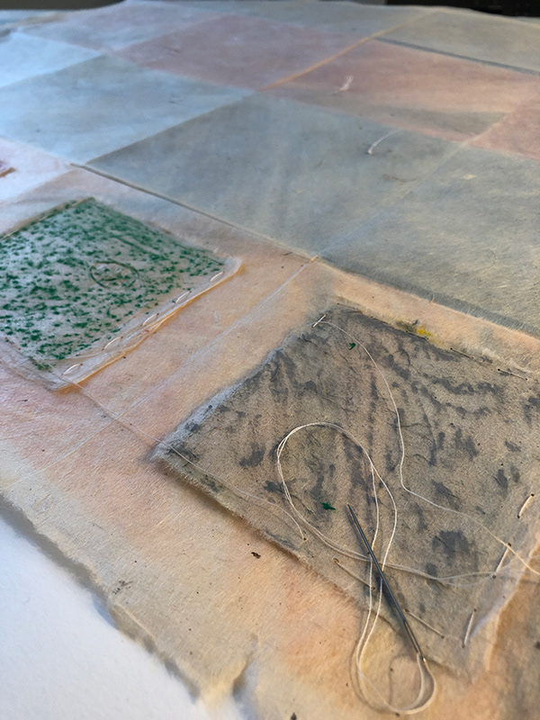
The nine printed squares had a mirroring nine ‘empty’ squares attached to them (image to the right). I do not see these as empty though because by pressing these two sides together, they may be seen as ghost prints – they do not contain emptiness but memories of the walk.
Because this was a return walk – on the way back I did not physically, but mentally, document the landscape and its constructions – the latter squares are equally representatives for the walk and my presence in the landscape and therefore equally important parts of the map.
Because this was a return walk – on the way back I did not physically, but mentally, document the landscape and its constructions – the latter squares are equally representatives for the walk and my presence in the landscape and therefore equally important parts of the map.

A construction
The sheet of Lokta paper was initially part of a larger sheet, which offered the possibility to attach and develop the two into a larger print. I debated whether to print onto the larger Lokta as well, potentially utilising the found objects I had collected during my walk. However, I kept developing the idea and it merged with the use of a third sheet
– this one was much more solid,
a BFK Rives sheet.
I started to envision this piece of work as a construction
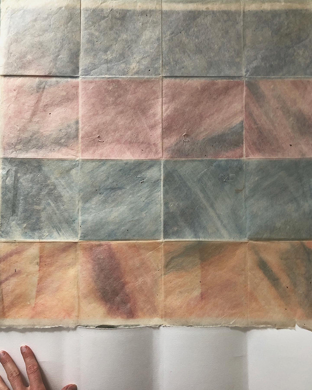
and merge of layers and what the three sheets all had in common was that they had been on this journey together, brought to the coast and back again to London. I divided and separated the smaller squares and placed them on top, sensing though, it lacked depth and expression. It merely conveyed the surfaces documented on the frottage walk. I decided that I needed to introduce a frottage ‘quilt’ of the found objects and this is where I could include the colour scheme that became so important in attracting me to this place (image to the left).
.
The sheet of Lokta paper was initially part of a larger sheet, which offered the possibility to attach and develop the two into a larger print. I debated whether to print onto the larger Lokta as well, potentially utilising the found objects I had collected during my walk. However, I kept developing the idea and it merged with the use of a third sheet
– this one was much more solid,
a BFK Rives sheet.
I started to envision this piece of work as a construction
and merge of layers and what the three sheets all had in common was that they had been on this journey together, brought to the coast and back again to London. I divided and separated the smaller squares and placed them on top, sensing though, it lacked depth and expression. It merely conveyed the surfaces documented on the frottage walk. I decided that I needed to introduce a frottage ‘quilt’ of the found objects and this is where I could include the colour scheme that became so important in attracting me to this place (image to the left).
.
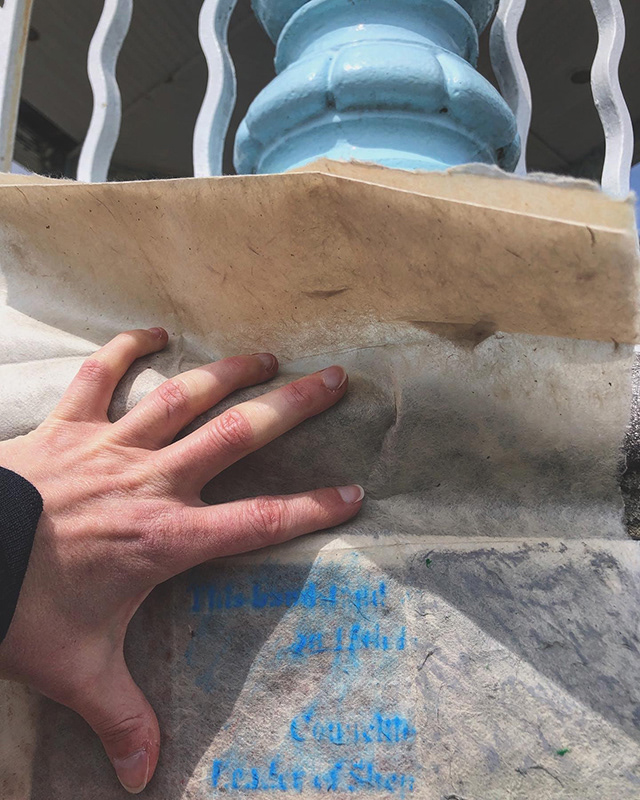
The importance of Handmade
Before I did that, I debated how to best attach the layers.
Should I use glue or tape and would it compromise the fragile paper and overall appearance?
Ideas floated towards sewing, and although I considered using a sewing machine as the most time effective option, it did not feel as right as using my own hands. I decided on hand-stitching the squares reflecting the importance of hand-made and not separating myself from the making of the map by the use of any
mechanical tools. I am constantly taking a line for a walk by foot, therefore I should also do so by hand
Impressions and memory
In the final piece, I have focused on my own impressions and memory – what attracted me beforehand, what met me as I arrived
and what I take with me afterwards.
That being said,
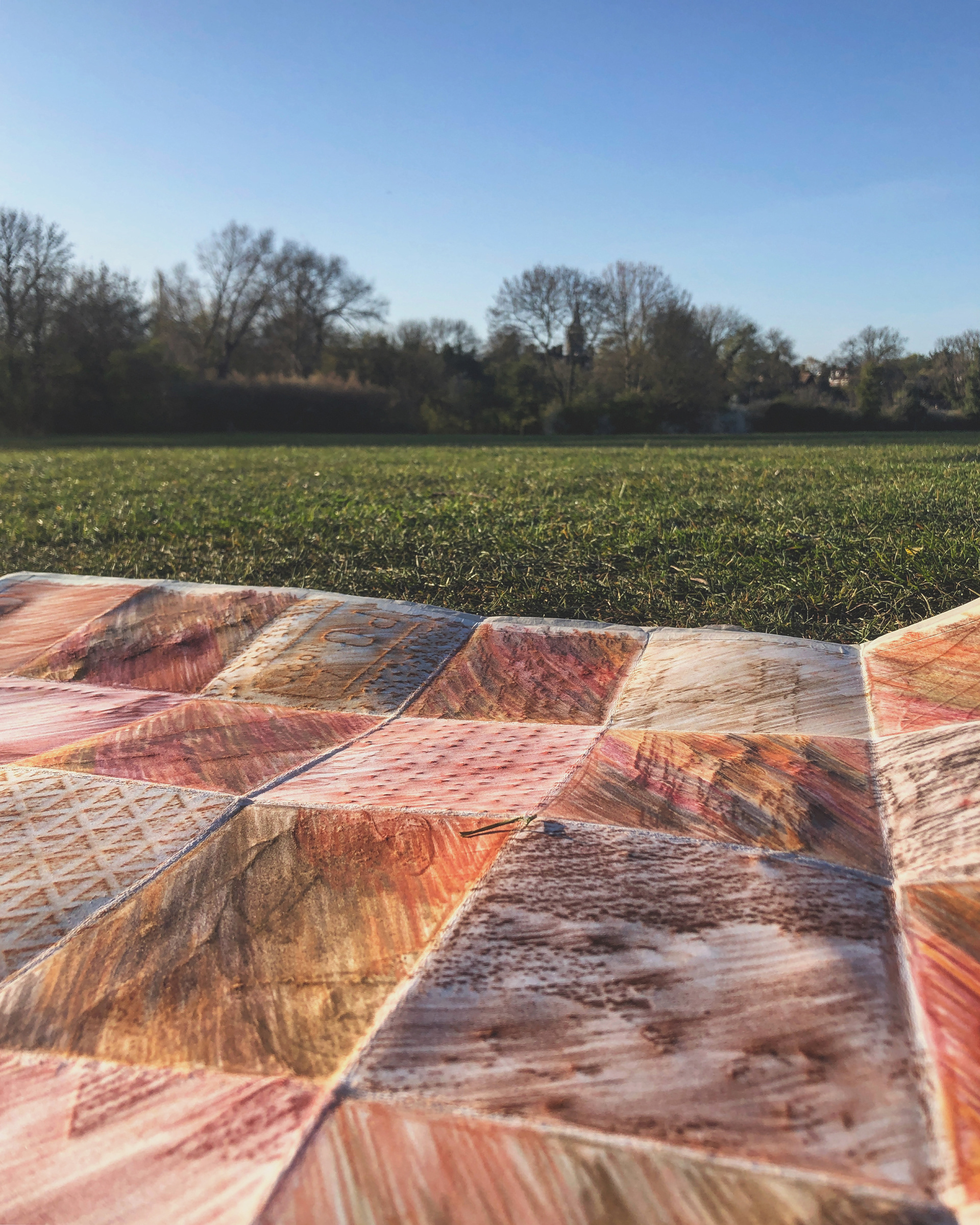
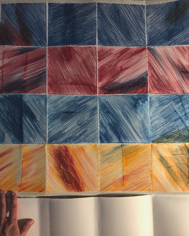
I also took inspiration from the Logo’s colourful squares when I carefully selected the four colours to use in the frottage print of objects (image to the left).
These four colours are positioned horizontally to depict the seascape and horizontal line
(image to the left), and they are bright, stark, they represent what my impression was and still is of this vibrant place, the people and the art that inhabits it (images below).
In the final piece, I have focused on my own impressions and memory – what attracted me beforehand, what met me as I arrived
and what I take with me afterwards.
That being said,
I also took inspiration from the Logo’s colourful squares when I carefully selected the four colours to use in the frottage print of objects (image to the left).
These four colours are positioned horizontally to depict the seascape and horizontal line
(image to the left), and they are bright, stark, they represent what my impression was and still is of this vibrant place, the people and the art that inhabits it (images below).
Tokens
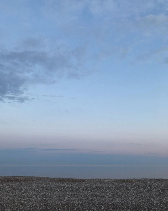
But what you take with you from a place becomes in hindsight much more important than what you experience there, because the experience transforms into memories, and these are the tokens that you may carry with you for the rest of your life. One particular memory from this trip is what I wanted to convey when I added the larger Lokta paper as a transparent layer on top of the colourful ‘seascape’ (image to the right). Together they merged into a new expression – fused the colours and blurred the lines, they brought me back to one particular evening when Kåre and I went down to the beach and watched the day slowly ebbing (images below).
Its colours had started to fade, though fade is a transparent word as it does not reflect the sheer beauty and absolute magic of the pastel colours that lowered down as a calm blanket over the horizon.
Every single object turned into that quiet and muted mode before the light disappears and sleep arrives.
Although I associated neither this place nor the coast with pastel colours, I do now and it’s a result of place, time and us who were there - together.
As the sun’s power left the surface it was the remaining fragile shade that made it impossible to find the line in the horizon and separate the sea from the sky.


'If in doubt, keep walking'
Hamish Fulton
I attached this transparent layer by stitching the smaller squares on top – pealing and threading the needle through the layers (image to the left). It is an ongoing thread where I did not end at each square but let the thread lead onto the next – reflecting the continuous walk. Where I ran out of thread, I carefully tied
and attached a new one and kept on going.
There was still one important layer to add to the map
– the walk itself.
An artist who never seems to fail to inspire me is Paul Klee, once again it was his ‘taking a line for a walk’
that generated an idea, this time more literally
– and technologically – than ever.
In my fascination for maps and walking,
the downloading of a walking app that tracked my activity
and showed them on a map only felt natural.
that generated an idea, this time more literally
– and technologically – than ever.
In my fascination for maps and walking,
the downloading of a walking app that tracked my activity
and showed them on a map only felt natural.
Enclosing the map
The idea of utilising this app in my art, I have to admit,
felt quite brilliant as I did not only envision my walk as a line on the map, I literally drew it by walking.
In previous maps, I have added this line as the final layer
– something that the introduction to the Printmaking room at MDX helped me realise. This was also the case with the coastal frottage map.
The line – the walk – was added as a monotype,
created by painting a thin black line onto an acetate sheet before printing it on top of the map (image to the right). The line places my walk and me in the landscape depicted and encloses the map.
Together these layers inform me of the landscape
that I walked in, the impressions this place provided
and the memory it left.
that I walked in, the impressions this place provided
and the memory it left.

All images: Åse Vikse, 2021