11th April 2022
New website! New exhibition!
Not the most important first, but,
I will be moving the content of this website over to www.asevikse.com
This is purely for economic reasons as I have found this online portfolio very workable and easy to maintain. Because I already have the domain asevikse, it seemed the most ideal option at the moment. Bear with me while I make the move, there may be some occasional errors and 'under construction' glitches.
In other news,
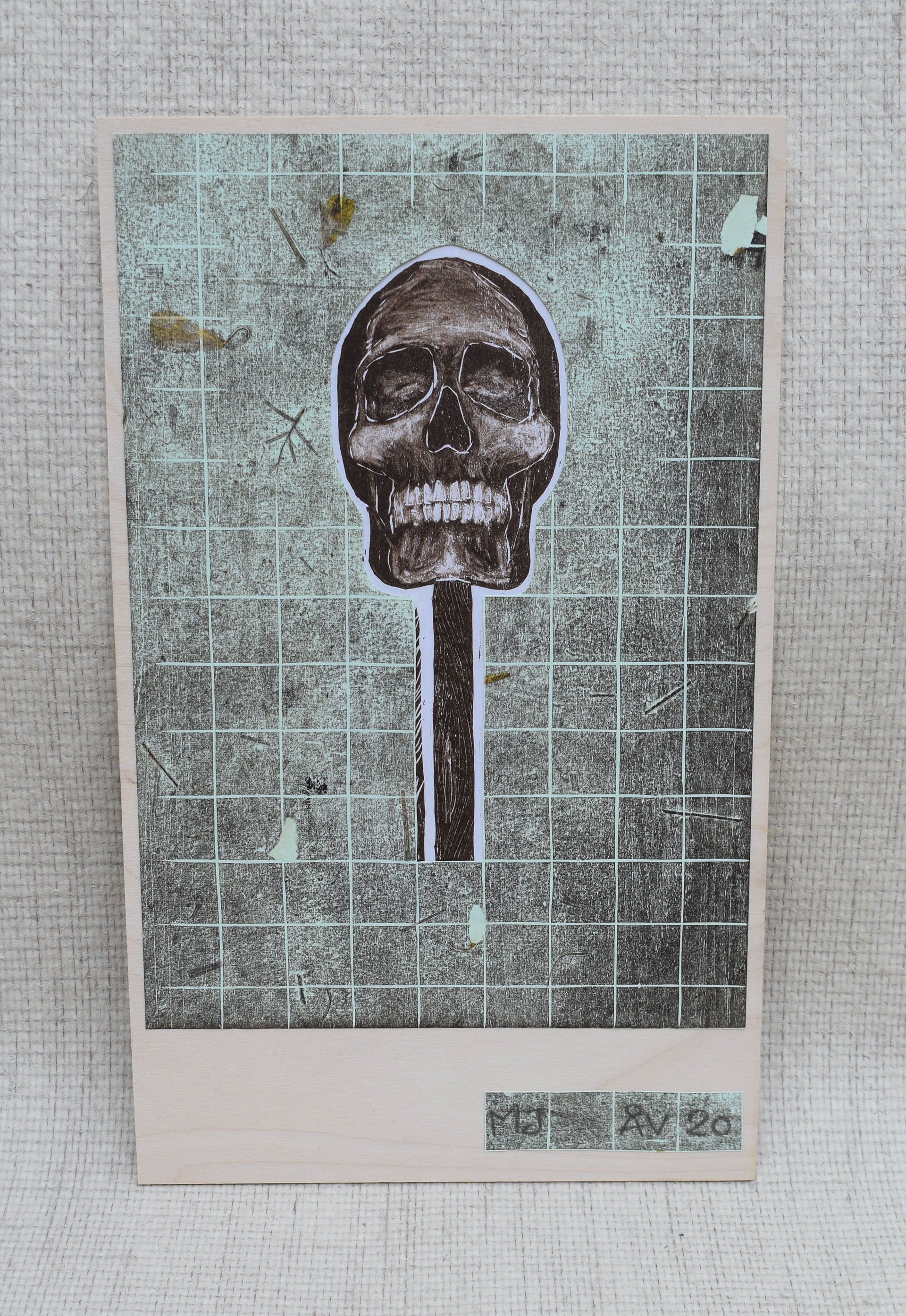
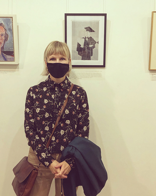
my recent collage 'MJ' has been selected for an exhibition in Sheffield!
This is of course very exciting, and for many reasons. One, I have never been to Sheffield before, although my artwork has already travelled all the way up there by herself. Second, and most importantly, this is artwork that has never been seen before, made for my Honours project back in 2020 in Aberdeen. It was therefore supposed to have been exhibited at my graduation show, which naturally did not happen because of the lockdown.
To be able to show this collage – a merge of the initial 'the Skull' and an edition of the book cover, both inspired by Norwegian author Edvard Hoem's books – means quite a lot to me. It has been a chapter (!) that always waited to be read in order to be finished. My decision to submit this artwork as a collage was a way of submitting new artwork without it being new. These are prints that have been left in a drawer since 2020, and they deserved to start anew.
Or Margrethe Jakobsdotter needed to. Because it's not simply 'a skull', it's her, and I aim to share her story.
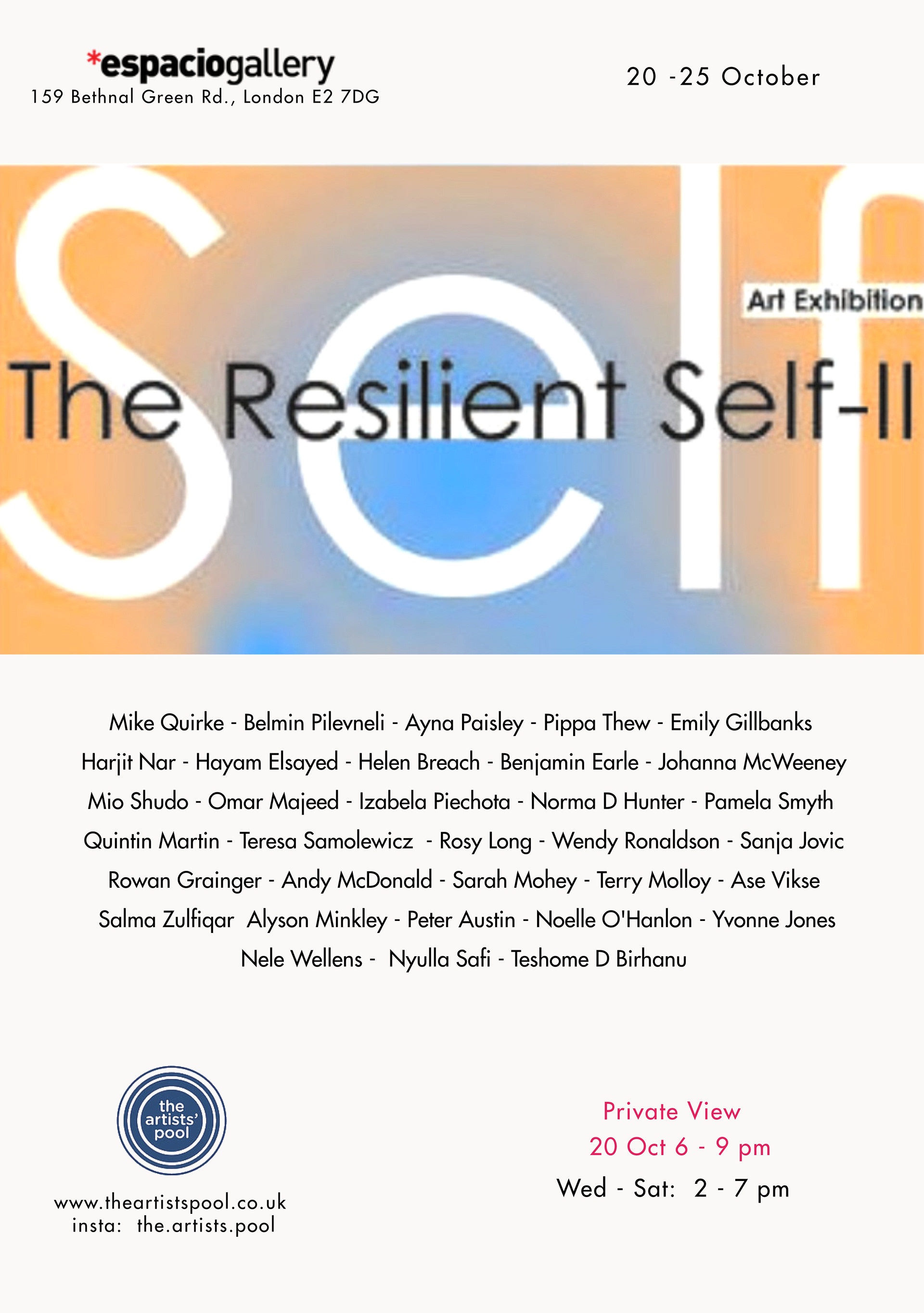
Below is information about the group show at Fronteer gallery, commencing the 28th of April.
The private view is the following week, the 5th of May.
I am looking so much forward to being reunited with MJ at the PV, and if you are in the area, please visit!
Or Margrethe Jakobsdotter needed to. Because it's not simply 'a skull', it's her, and I aim to share her story.
Below is information about the group show at Fronteer gallery, commencing the 28th of April.
The private view is the following week, the 5th of May.
I am looking so much forward to being reunited with MJ at the PV, and if you are in the area, please visit!

•
8th March 2022
Happy International Women's day!
Gratulerar med kvinnedagen!
Gratulerar med kvinnedagen!
Introducing this year's pioneer woman,
Anni Albers (1899 – 1994)
Anni Albers (1899 – 1994)
The weaver Anni Albers follows Lilla Hansen and Henrietta Barnett as previous pioneer women that I have chosen to dedicate a portrayal in order to mark this day annually.
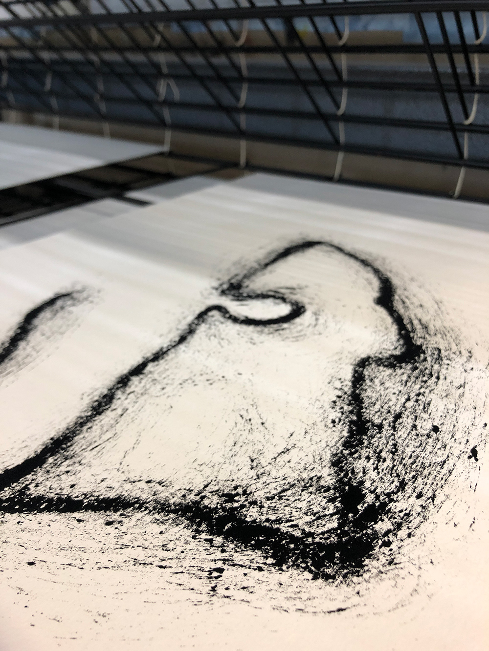
The print in the image is still a work in process, I will add layers to it and slowly outline Anni's fascinating profile.
I wrote an essay in 2018 about the numerous artistic women at the (then) highly modern Bauhaus, where you would assume female students got as much space as their male equivalents, but that was not the case.
During the research, I found Anni's story to be extremely fascinating and thus, I have enjoyed diving into further stories for this dedicational portrait.
Anni was not allowed into the studio, where the 'real art' was made, as it was not a place fit for women.
Nevertheless, that did not stop her from making real art in the weaving workshop.
Nevertheless, that did not stop her from making real art in the weaving workshop.
She may not have gotten what she wanted, but she made something out of what she had.
And she made it perfect.
And she made it perfect.
•
23rd February 2022
Exhibition news!
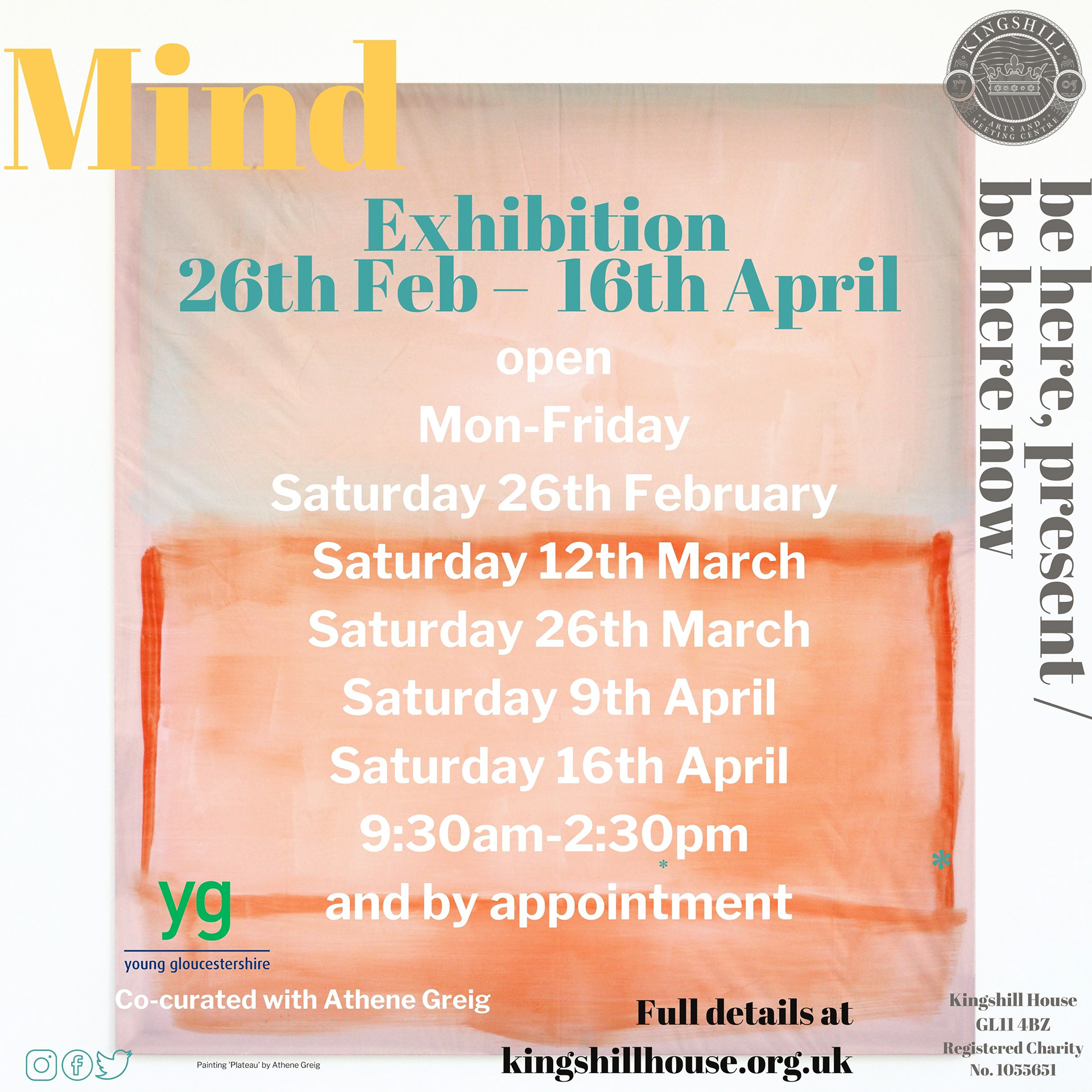
My artwork has been selected to be part of the 'Mind' exhibition at Kingshill House in Dursley.
The beautiful Kingshill House lies within the picturesque Cotswolds, which some may say is the epitome of the English countryside. I went there last week, only for a short visit, to deliver my artwork. I cannot wait to go back this Friday, for the private view opening. If you read this, then you are warmly invited!
Friday the 25th February, 6-8 pm
Friday the 25th February, 6-8 pm
I will spend the weekend in and around Dursley, hopefully walking and surely enjoying art.
See you there?!
See you there?!
•
9th February 2022
Mend and make do
It's been one month since my final submission for my MA in Fine Art Printmaking. After an intense but rewarding period, I have had to focus on 'mend', before I could continue with the 'make-do'.
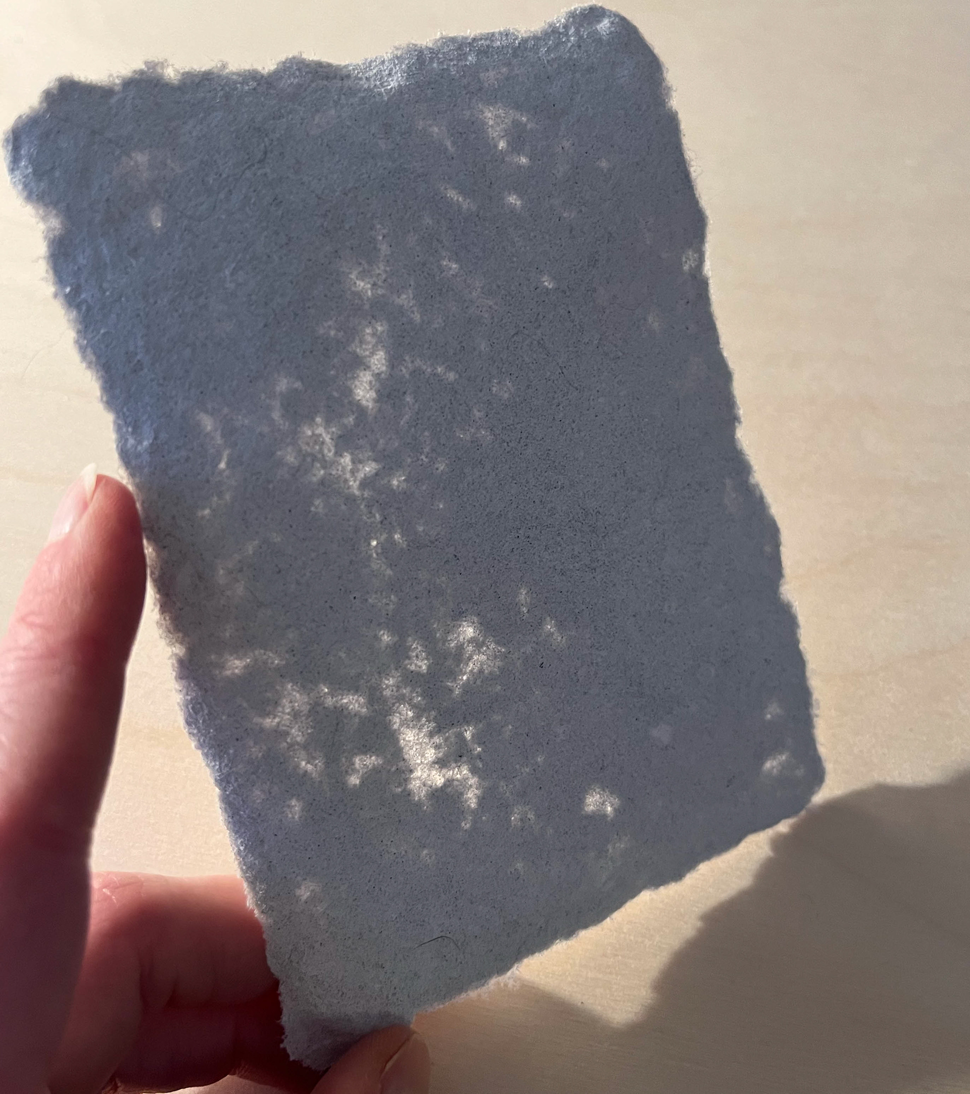
A project I've been wanting to explore for a while is papermaking. After completing my Major project I needed something to experiment with that could offer a sense of mindfulness. I often find a sense of calmness in a slow process. That's why making my own paper seemed like the perfect first project after my MA.
I would like to say it's been successful so far, but then I will probably have to debate what 'successful' is. I'm not quite sure if I have the answer to that, but I do not measure success in capitalism or perfectionism. In my process-led practice, I measure what I may gain from a project in values such as educational or rewarding.
The process of making paper has been rewarding, exemplified in moments where I realise that I've transformed scrap material into a new sheet of paper. It's also been rewarding to discover that the paper I have made has been strong enough to hold an imprint of a feather, a leaf, and the experimenting phase continues.
I didn't do a lot of research prior to trialling the papermaking because I needed it to be as uncomplicated as possible. I got suggestions and advice from others, which was great, but I had to stick to what was simple. I learned as I went.
I didn't do a lot of research prior to trialling the papermaking because I needed it to be as uncomplicated as possible. I got suggestions and advice from others, which was great, but I had to stick to what was simple. I learned as I went.
My plan going forward is to develop this project and merge it with my artist's maps.
I also aim to explore a non-waste practice in order to become more environmentally sustainable.
I also aim to explore a non-waste practice in order to become more environmentally sustainable.
I will post my first print on handmade paper in the 'work' section, and I will try to post more often in this section.
I have some exciting news to share soon, stay tuned!
•
15th October
Imprints
–now also in clay!
–now also in clay!
I see imprints as something that I haven’t created but the object and that
‘the imprint is already there, it simply needs me to lift it’.
‘the imprint is already there, it simply needs me to lift it’.
Added to that, the mentality of exploring, rather than searching for a perfect final product made me arrive at the ceramics workshop with the aim to explore imprints in clay.
I feel like I took my way of seeing imprints to another level when my mere experiment turned out as I hoped it would.
I placed organic found objects – from my recent walks by the norwegian coast –
in the (still wet) clay after which it was fired.
in the (still wet) clay after which it was fired.
In this process I did not even need to lift the imprint, as it vanished and left its perfect and beautiful mark in the rough surface.
Thankfully I – the maker – decides what's perfect to me.

21st September
Summer moved on
I'm on the other side of a good and eventful summer
which I'm very grateful for.
which I'm very grateful for.
My last post here was (already!) two months ago and lots have happened since.
First of all, speaking of my last post, I made it down to Folkestone and hung my series 'Modern Nature' in Oxfam Books & Music's window.
I am filled with gratitude to be part of a community of artists who have been – or are – exhibiting in Folkestone.
Many artists whom I admire show their work there – I stepped at least one level higher on my artist's ladder as I stood in front of the (my!) window display. An enormous thank you to Folkestone Fringe with Olivia Franklin who made this possible, and also to the kind people at the Oxfam Bookshop who were absolutely lovely and who showed great interest in my art each time I visited. I will return. Actually, in late October. But more about that later.
I also made it to Norway during the summer. It was really good to come home after a year of uncertainty. To meet family and friends, and to see familiar landscape. Within this familiar landscape, I also commenced research for my upcoming Major Project. It feels strange to say 'upcoming' because this project is something that has been grinding in my mind since I decided to start the application process for a Masters Degree. I am investigating memorials and what I have found – and done – so far assures me, this feels right.
I realised today that this is the last Tuesday I haven't got anything scheduled at this side of a (potential) Masters Degree.
That is if everything goes to plan of course, let's not jinx this.
I'm looking forward to starting now,
here goes!
That is if everything goes to plan of course, let's not jinx this.
I'm looking forward to starting now,
here goes!

22nd July
Exhibition news,
Modern Nature showing in Folkestone!
I'm soon off to Folkestone where I will be showing my series 'Modern Nature'
I'm soon off to Folkestone where I will be showing my series 'Modern Nature'
•

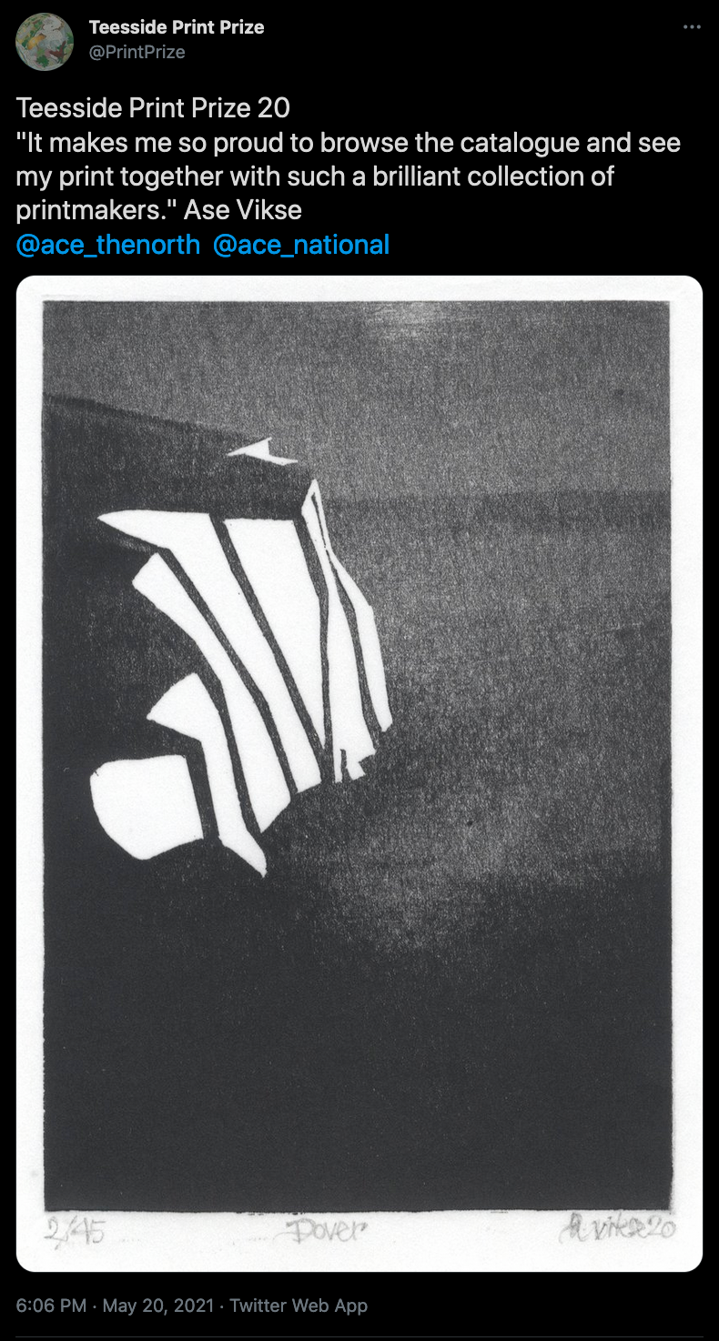
21st July
Dover at Waterloo Station, London
In May I entered NetworkRail's student competition 'Wish I was there.
On Monday I went to Waterloo Station to see the travelling exhibition where my woodcut Dover is on display. I was selected as one of the top 20 winners who get their artwork exhibited on train stations around the UK starting with Waterloo where it will be up until the 1st of August.
The exhibition will continue to:
Reading Station: 2 - 8 August
Liverpool Lime Street Station: 9 - 15 August
Leeds Station: 16 – 22 August
and I'm especially pleased that it will travel up to Scotland to
Glasgow Central Station: 23 – 29 August
14th July
Almanac
'Grateful' – sums up how I feel about the opportunity to exhibit in a London gallery with my fellow MA students at our group show 'Almanac' last week.
Also, 'proud', of what I have produced over the past six months despite slightly challenging circumstances. It is because of these circumstances that my prints have developed in a completely new direction, I am however steadfast in my direction – about to embark on the final project in my Masters in Fine Art Printmaking.
Here I am in front of some of my work at Coningsby Gallery in London.
Watch this space,
some exciting news may await in the near future!
some exciting news may await in the near future!
Visit my instagram to see more work https://www.instagram.com/asevikse/

16th June
About Mapping
I have up until a month ago focused on 'place' in my mapping practice, which has involved the landscape or more precisely, a way to interpret the landscape that I move in. That I walk in.
I have up until a month ago focused on 'place' in my mapping practice, which has involved the landscape or more precisely, a way to interpret the landscape that I move in. That I walk in.
Although I would not necessarily say that I move away from the theme of 'place' in the work I am currently developing, my focus may simply have shifted slightly.
It has shifted from the landscape, to the body that is moving in the landscape. Who is observing the landscape.
It has shifted from the landscape, to the body that is moving in the landscape. Who is observing the landscape.
It is now two months since I attended a webinar hosted by Art Fund about Derek Jarman. Prior to this, I was only aware of Jarman, but this awareness was limited compared to the absolute fascination I found as the webinar unfolded.
This fascination is constantly growing. After the webinar I absorbed 'everything' I came across about him. Podcasts, articles, interviews, videos, books…
These now create the basis for research around this interesting person.
These now create the basis for research around this interesting person.
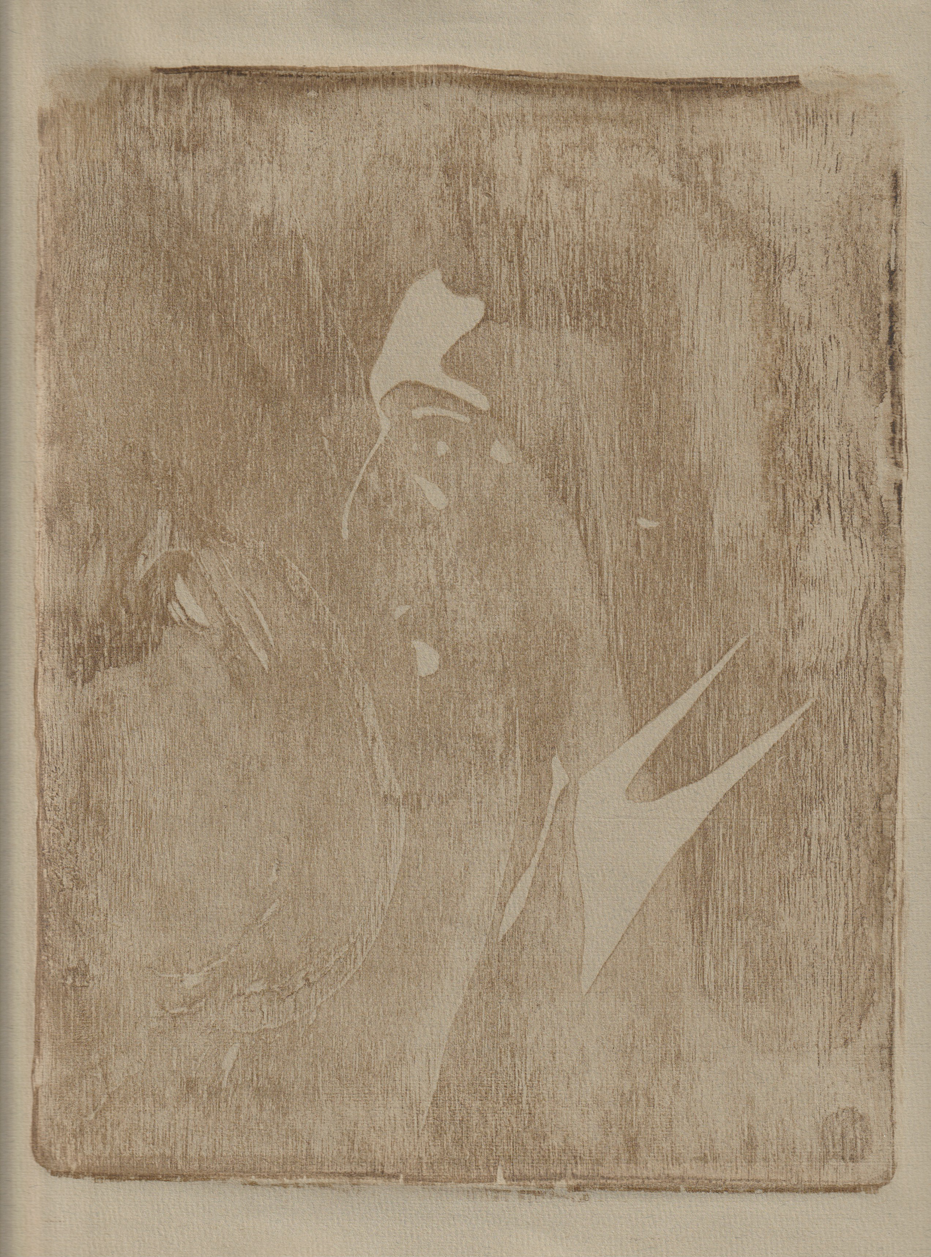
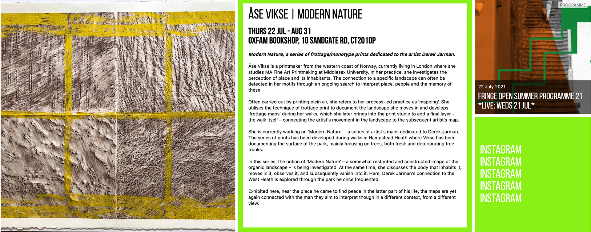
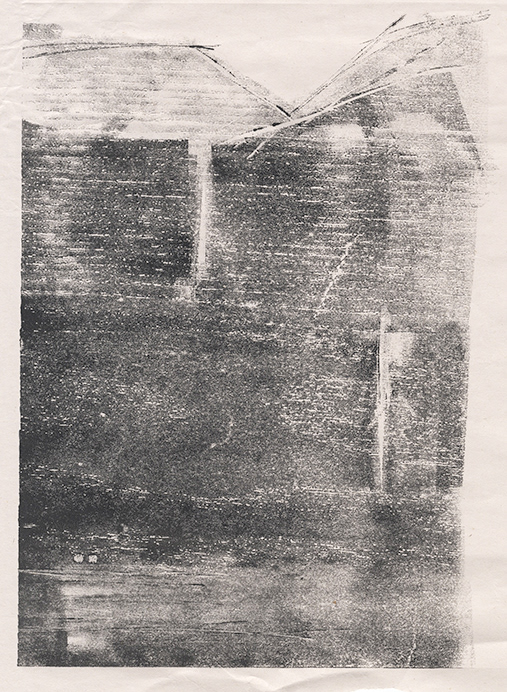
I have created two maps – based on the principles I have developed referred to as frottage walk maps – where I explore the notion of 'Modern Nature and the theme is Derek Jarman. One of them can be seen here to the right (under construction hence the bad quality photo). As these large prints emerge from the process of creating them, I realise they belong under the same 'construction', if we can see construction as simply something that holds plural related content.
In other words, I am currently developing a series of prints dedicated to the artist Derek Jarman.
I reflected on what exactly it was that caught my attention with Jarman - his art? His activism? His garden?
Though it may have been all of the above, probably most of all it was the little dark hut with the bright yellow framed windows.
Mixed in with the fascination, there might also be a degree of longing…
Though it may have been all of the above, probably most of all it was the little dark hut with the bright yellow framed windows.
Mixed in with the fascination, there might also be a degree of longing…
•
27th May
Dover Revisited
The Catalogue received from the Teesside Print Prize 20
The Catalogue received from the Teesside Print Prize 20
Unfortunately, I was not able to visit the exhibition
– held in Middlesbrough April/May 2021 –
but when my little Woodcut returned back to me in London along with the catalogue,
somehow I knew I had been there.
I wrote to Adrian Moule
– the excellent organiser of this print prize –
and expressed my gratitude, see tweet below.
– held in Middlesbrough April/May 2021 –
but when my little Woodcut returned back to me in London along with the catalogue,
somehow I knew I had been there.
I wrote to Adrian Moule
– the excellent organiser of this print prize –
and expressed my gratitude, see tweet below.
What I received back from Adrian
was not just a comment,
it was the most beautiful compliment I have received for any of my prints:
was not just a comment,
it was the most beautiful compliment I have received for any of my prints:
'You were there, the sentiment, lighting, drama and narrative of the intimacy you shared with the block, each permission given by the wood,
the grip of the ink in the grain,
laying itself out to meet the surface of paper.
Your thoughts unravelled and exposed to the audience.'
the grip of the ink in the grain,
laying itself out to meet the surface of paper.
Your thoughts unravelled and exposed to the audience.'

4th May
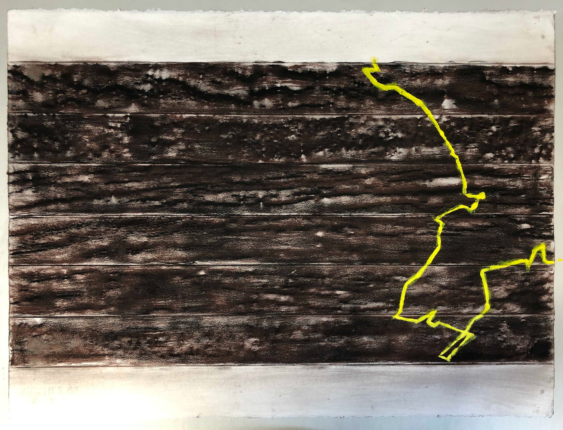
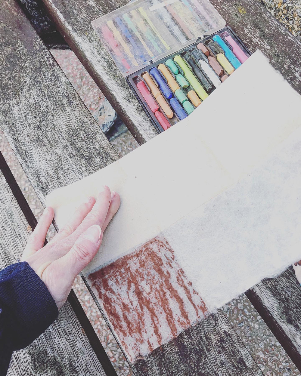
Coastal Frottage Walk
I’m back in London after an inspiring and rejuvenating (!) visit to the south coast of England. More specifically Hythe and Folkestone in Kent.
As planned, I created a Coastal Frottage Map during one of my walks – from Hythe to Folkestone and back again.
In the image, you can see the bench where I both started and ended the mapping of this beautiful, colourful and creative area.
This Frottage Walk was a way to map out surfaces in the landscape, represented by the different constructions, including art, as Folkestone is well known for.
A bit of an experimental Frottage Walk this, as I trialled Lokta handmade paper and used different pastel qualities to apply the rubbing with.
Maps can be seen as replicas of the landscape, also when it comes to the use of colours.
I had not set out a concrete plan for which exact colours to use on my Coastal Frottage Walk, but I had the impression of this area as very colourful – which was what initially drew my attention towards it. Therefore, I brought with me a range of colours and as I commenced on the walk it became clear to me that I also commenced on the act of replicating the colours I encountered.
Because my colour pallet was limited – a result of plein air creating and having to carry everything with me – I had to be more of an inventor than an imitator.
These maps are always my interpretations of the landscape. No right or wrongs.
We speak different languages but we do understand each other. I am merely the translator and aim to tell its story.
We speak different languages but we do understand each other. I am merely the translator and aim to tell its story.
30th April
What's another year?
This weekend I've taken some time off and relocated to the South of England, to the coast! Husband, cat and I are staying in a lovely cottage in the equally lovely little Hythe, just west off Folkestone. And speaking of Folkestone – that was the reason I wanted to go here – I've been fascinated by this colourful place ever since we were introduced to it through one of our lectures.
A bonus is that my newfound interest in Derek Jarman hopefully will take me to Dungeness on my birthday. I can't think of a better way to celebrate my 40th – at the coast surrounded by art and inspiration. Yes, of course, I would have wanted to celebrate with friends and family, but I am very much surrounded by love.
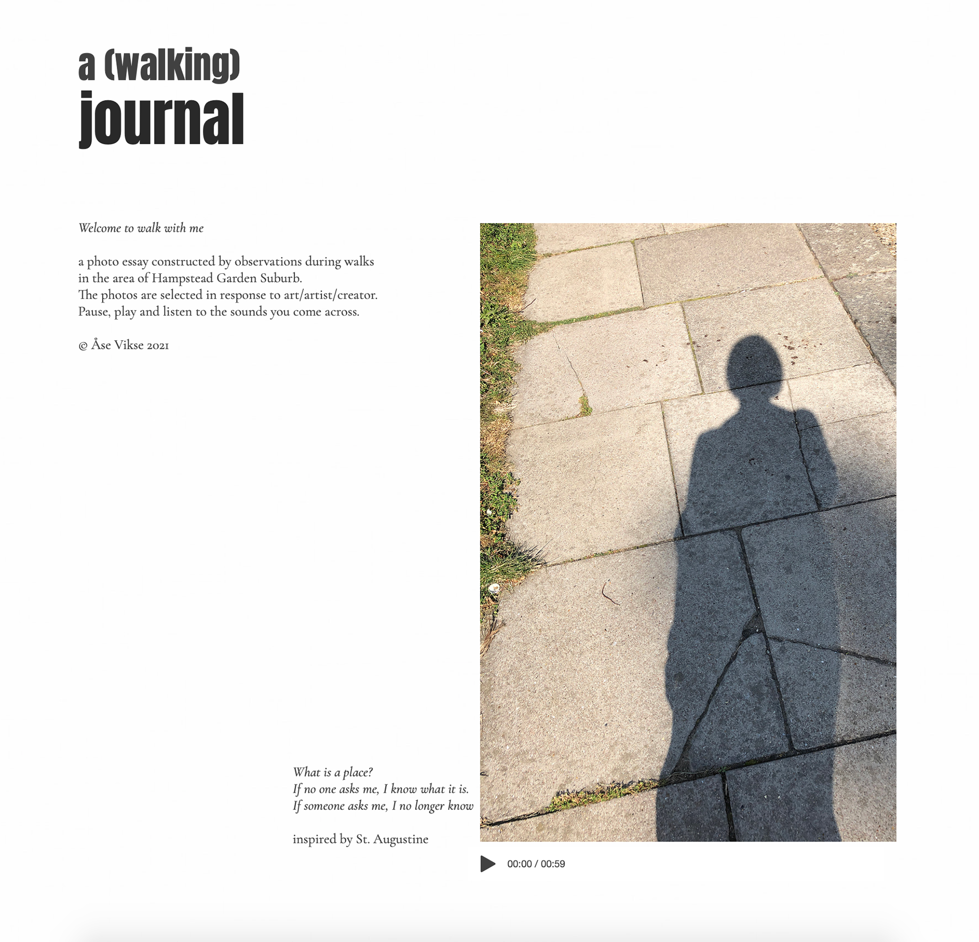
I'll be out and about on my Frottage walks now,
meanwhile, you are welcome to walk with me via my Photo Essay:
https://www.asevikse.com
meanwhile, you are welcome to walk with me via my Photo Essay:
https://www.asevikse.com
19th April
End of term
This was the last thing I wrote in my sketchbook
as the first term came to an end.
It was the best possible way to round off a term:
Filip and I went into the Printmaking room on Friday.
As the technician Freddy took me through the University,
I said ‘this is huge’ which he probably interpreted as ‘in scale’.
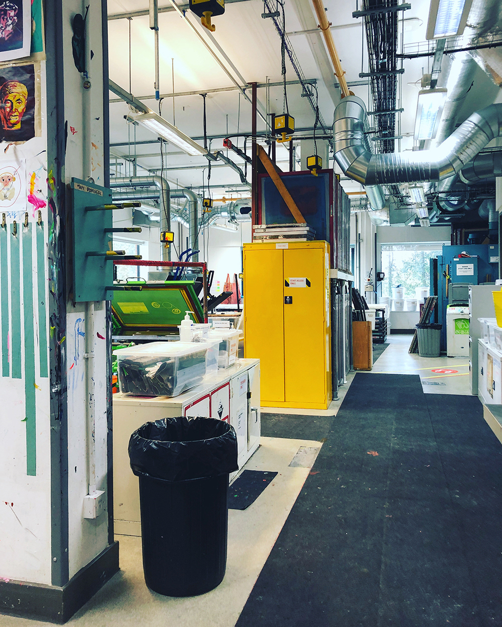
And Middlesex University is huge in scale, but for me, this was so much more. I left the printmaking room at Gray’s School of Art in March 2020, never to return again. I am a workshop person, I thrive in the workshop,
I am at peace in the workshop.
This was the last thing I wrote in my sketchbook
as the first term came to an end.
It was the best possible way to round off a term:
Filip and I went into the Printmaking room on Friday.
As the technician Freddy took me through the University,
I said ‘this is huge’ which he probably interpreted as ‘in scale’.
And Middlesex University is huge in scale, but for me, this was so much more. I left the printmaking room at Gray’s School of Art in March 2020, never to return again. I am a workshop person, I thrive in the workshop,
I am at peace in the workshop.
I started walking at the introduction of lockdown.
Not that I haven’t been walking before,
but now it became of great importance.
We walked our way through the lockdown in Aberdeen,
saw the spring arrive, welcomed the beautiful flowers, insects, odours…
Until the summer arrived, then the autumn and we found ourselves
in a completely different city, different environment, atmosphere
– North London.
We kept walking, it formulated a new knowledge and gradually
a familiarity about our area. Subsequently, it also formulated all
my projects in one way or another, but indeed not in any way I had anticipated or could have foreseen before I arrived here,
at the end of all these projects.
But that’s not how it is – it’s not the end at all. It’s something to continue, something to build upon, to take further.
On Friday I returned to the printmaking room – with my walks.
They are a part of what I have gained and what I will take with me
from this past year.
I will keep walking.
On Friday I returned to the printmaking room – with my walks.
They are a part of what I have gained and what I will take with me
from this past year.
I will keep walking.
31st March
Three months later…
I am a bit ashamed to discover it's been three months since I updated here, but there is a good reason for it.I would even go as far as to call it a good excuse.
Since the last time I wrote an update here I've become a full-time Master student at Middlesex University.
My MA is in Fine Art Printmaking and I thoroughly enjoy it.
Yesterday I had a tutorial and I was reminded of this page.
Not directly though, but I was asked whether I was keeping a blog. I said no, and referred to previous blogs I’ve had, which I've decided to more or less discontinue because it requires quite a lot of devotion in terms of time.
Then I came to think of this ‘thoughts and updates’ section here of my online portfolio. Well, in a way that can be seen as a blog?
The problem is still, I need to devote time to update it.
The neglection of this section since January reflects that.
When there’s too much ‘stuff’ in my head, I try to scale down on things to focus on, as a means to ‘tidy up’. (Which now translates to 'spring clean'?!)
Then I was thinking that I could perhaps combine what I write and post in my digital sketchbook and apply it here?!
Well, this is a result of that. I'm sure I won't be able to post every day, but more often is achievable.
–
Update: I'm currently working on a written piece for our Symposium which will take place in two weeks. This means an oral presentation will be given in front of all the MA students (and staff I assume) to back up the written piece and this will happen digitally – the same as everything else at the moment.
However, we have had some good news recently about the Printmaking Studio opening up again fairly soon.
So this is exciting.
–
The image to the right – a photo I took in Bergen in 2009 – arrived into my conscence today.
I thought it was fitting in relation to the subject I'm currently writing about which is 'place'.
This image holds a lot of memories and associations.
It also reads 'Ples' on one side and 'Pels' on the other.
'Ples' is a typographical error, the fact that this has happened on a large sign in a busy spot in the city I find very humorous. I think someone must share my sense of humour because it must have been like this for a very long time without anyone correcting the error.
'Ples' is pronounced (in Norwegian) as you would say 'place' in Scottish, which I think is nice since I after having lived in Scotland for 5,5 years will cherish that place forever.
(Also, the correct version 'Pels' means fur.
The word 'Ples' in Norwegian does not exist...)
–
If I don't update this before the weekend, I'm wishing you a very good Easter
• God Påske!
• God Påske!

January 4th 2021
Happy New Year!
A new year, new opportunities,
a new start.
a new start.
It became a bit busy in the weeks after my last post here,
hence the silence.
I was working on two reduction woodcuts that I had to finish
in time (to send them) for Christmas.
One had five layers and the other one only lacked its last layer,
however, I found it very challenging to get everything right.
Those who know printmaking also know that printing can't be rushed,
at least that's not how I like to work.
At the end I was pleased with both results. You can see them
in the new posts in the 'work' section, titled 'Johan' and 'Berit'.
in the new posts in the 'work' section, titled 'Johan' and 'Berit'.
While Advent and Christmas both came and went, it wasn't without disruptions from the pandemic. Probably unavoidably, but we went into lockdown again just before Christmas. It didn't create any difficulties for us, but all the negative and depressive news about
a new more aggressive mutation, the continuous shift in rules,
tiers and restrictions took its tall. I did manage to carve woodblocks amid the not-so-encouraging climate, the last thing I did before I gave in a week before Christmas
and just dived into cooking, baking, decorating
– the joyous preparations.
I've been working on a landscape motif for a while, in the image
to the right, you can see an early test monotype which I quite liked.
to the right, you can see an early test monotype which I quite liked.
Today – as we're (relatively) back on track from the holidays –
I've given up the study so that my husband can have a 'proper' office for a while. I'm in the living room. We'll see how we can share the space between us, I'm sure we'll work it out so that I'll be able to develop the print further.
I've given up the study so that my husband can have a 'proper' office for a while. I'm in the living room. We'll see how we can share the space between us, I'm sure we'll work it out so that I'll be able to develop the print further.
Today I've researched new awards and open calls to submit to,
and found a few.
I'll keep you updated!
and found a few.
I'll keep you updated!
November 27th 2020
It's beginning to look a lot like
advent.
We're approaching the first Sunday of Advent. The first of four Sundays leading up to Christmas. Advent means waiting time, and I find it very meaningful to hold on to the traditions of lighting candles to create light, warmth and anticipation for what's to come.
In a year where everything is uncertain, one thing is very certain and constant. This Christmas will round off and subsequently be the end of a year that has been significant in an extreme way.
This year has not just been negative, it has also taught me some useful techniques that I will continue to apply, probably for the rest of my life.
One of them is to try to focus on the positives in the darkest of times.
This might mean that you have to actively search for light, but when you find it,
make sure you don't lose sight of it.
One of them is to try to focus on the positives in the darkest of times.
This might mean that you have to actively search for light, but when you find it,
make sure you don't lose sight of it.
Printmaking has been one of those lights.
The same with outdoor walks.
The magnificent colours of the nature.
Animals (both wild and domestic).
A live yoga session on Zoom.
And Christmas.
The same with outdoor walks.
The magnificent colours of the nature.
Animals (both wild and domestic).
A live yoga session on Zoom.
And Christmas.
Although we've decided it's not safe to travel home for Christmas this year,
we'll make it happen. We'll create our own Norwegian Christmas in London.
we'll make it happen. We'll create our own Norwegian Christmas in London.
The last couple of weeks I've been working on a gift, which means I can't show any details yet. I can tell you that it's a reductive woodcut in black and grey (shocking!) where I've currently cut the third layer – ready to print on Monday. My biggest concern at the moment is that I'm running low on white Ink, which wouldn't be a problem if we weren't in lockdown. Yes, it lifts on Wednesday, but ideally,
I'll be ready to print the last layer by then. We'll see if it's solvable.
I'll be ready to print the last layer by then. We'll see if it's solvable.
Meanwhile you can have a look at the updated posts in my portfolio (under 'work').
I wish you who read this a lovely advent!
November 13th 2020
Grateful…
…is how I feel now, as I'm wrapping up my little woodcut 'Dover' and prepare to send it to North Yorkshire. As I've mentioned in previous posts it has been selected to be a part of the Transitions17's exhibition 'Teesside Print Price'.
The exhibition is planned to open in January, however,
we all know things are a bit strange this year and my predictions says next year might not be a totally different scenario.
But let us all hope and cross our fingers this will be an actuall exhibition! No matter what happens, I am very happy and grateful to be taking part in this.
A nice bonus is the potensial opportunity to win one of the three prices
of respectively £1000,- £600,- and £400,-
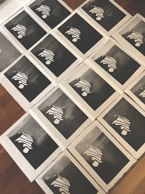
Last week I wrote about the new woodcut & monotype print I've been working on for the last few weeks with the working title 'Norwegian-ish'.
I've been debating back and forth whether to chose a different title.
I considered 'multi', but finally landed on 'Norwegian-ish' as the final title. I think it places the print within a context and makes it more self-descriptive. It sums up what enspired me
and describes what it is in short title.
I've been debating back and forth whether to chose a different title.
I considered 'multi', but finally landed on 'Norwegian-ish' as the final title. I think it places the print within a context and makes it more self-descriptive. It sums up what enspired me
and describes what it is in short title.
I desided to submit one of these prints to a competition as well.
('As well' as in – the same as I did with both lockgown and Dover).
This time I went further out, all the way to the US.
Why not celebrate the new era they're facing over there
by submitting my contribution to the International Print Center New York's Open Call 'New Prints'.
Announcements are expected around the end of the month.
This week I received a print from a fellow printmaker I've followed for a while on Instagram, Laura Young (check out her work here).
A linocut print called 'The Frog Song' which reminded me of childhood memories and also the inspiration I found through Instagram during the first lockdown. It was back then I noticed this print, when she printed the first editions. When it returned to her Etsy shop now after being sold out, I just had to order it.
A linocut print called 'The Frog Song' which reminded me of childhood memories and also the inspiration I found through Instagram during the first lockdown. It was back then I noticed this print, when she printed the first editions. When it returned to her Etsy shop now after being sold out, I just had to order it.
Which made me reflect on sales, Etsy, marketing, etc.
I could probably have opened an Etsy account and I might
have sold some prints there, many printmakers do that.
Many also, successfully so.
But whether I actively choose to do something different from that or if it's a path I have to initially pave to get my name out there,
I don't know, however, I choose to spend my energy seeking out competitions and possible exhibitions rather than to focus on marketing, branding and the commercial side of the 'business'.
In reality, I know I should probably do both. But the way I'm built
– I work better if I can channel my focus and energy onto one specific area.
I think also I strive more to the 'artist' aspect of being a printmaker as oppose to the 'illustrator'. NOT to belittle the title Illustrator (which I hold myself).
I admire and respect those who have the capability, energy and power to run an Etsy – or any other business – account,
in addition to create. Well done, and I will continue to support you in the way I can!
I've found it a bit hard to concentrate this last week,
which has put a pause on my creativity.
Wednesday I'd had enough of it and decided to just print.
I had an idea involving wreaths and colours,
I put on a good podcast, and just began.
which has put a pause on my creativity.
Wednesday I'd had enough of it and decided to just print.
I had an idea involving wreaths and colours,
I put on a good podcast, and just began.
I've used black and grey in my prints for a very long time now, somehow it seems I've been a bit tangled up in it.
Also, it's been a bit 'serious' themes in my prints resently,
resulting in a need for something brighter now.
It was a very bright day in the printmaking 'room' indeed,
you can see the result in the images. They might also reveal that I'm starting to crave that festive period we're getting closer to now. Those who know me, know that I've always been very strict on when it's allowed to put up the advent decorations (which is when it's advent in case you wondered), but this year – I just feel like we've had so much to struggle with, so much misery, things that didn't happen, losses etc – I think we all deserve to switch on the Christmas lights soon. Sorry, 'winter lights' that is.
The wreaths are monotype prints, on a really lovely paper that I bought just before lockdown hit us. It's a very thin handmade 'mountain paper' from Eastern Nepal called Lokta. It's 30gsm
and has a warm natural colour which makes the blue/turquois wreaths stand out. The paper and the wreaths complemented each other very well. In the image below, the wreath closest to us is painted on the plate with a brush before printing, which then has been repeated in numerous layers.
The same technique has been used to create the four others,
except I used a brayer to apply the ink onto the plate
as opposed to a brush, which you can see in the image to the right.
I also want to add a silver layer to (some of) them, possibly in the shape of berries.
Now I have to make sure the wrapping of 'Dover' is according to the guidelines, there's a lot to remember and take into consideration, and it's the first time I've done this so it's important to be precise and not to rush.
Wishing you all a very good weekend, and until next time
take care!


•
November 6th 2020
Lockdown 2.0 and new prints
(and update on the Teesside Print Price)
(and update on the Teesside Print Price)
We've now entered round two of lockdown here in England,
which means… not that much of a difference to be honest.
We'll be able to shop our groceries (and get fruit and veg delivered
to our door from the brill oddbox), I'll be inside in my printing room working, while Kåre will be at his home office (aka living room),
then we'll go out for walks and enjoy yoga on Zoom. We got this.
As I wrote in my previous post, I submitted 'Dover' to the Teesside Print Price and yesterday the preselection was completed.
I received an email saying 'Your artwork have been selected to go through to the next stage of selection.'
Great news! Will keep you posted on this.
I received an email saying 'Your artwork have been selected to go through to the next stage of selection.'
Great news! Will keep you posted on this.
Over the last few weeks I've also been working on a different woodcut in a similar technique as the Dover woodcut.
It's perhaps not accurate to simply call it a woodcut as it is
a combination of two techniques, including monotype.
I worked with this combination a lot during my Honours project, when I found this site useful: read this if you want to learn more about monotype.
It's perhaps not accurate to simply call it a woodcut as it is
a combination of two techniques, including monotype.
I worked with this combination a lot during my Honours project, when I found this site useful: read this if you want to learn more about monotype.
This new print currently has the working title 'norwegian-ish',
and is based on a design I developed about 16 years ago,
combined with new ideas.
and is based on a design I developed about 16 years ago,
combined with new ideas.
Lately I've embraced the freedom of being able to come up with ideas and transfer them into something more concrete
– more rapidly than before.
Where I've previously had to produce a certain set of proof which involved research, sketches, developments, feedback etc.
for the last three or so years, I can now choose to go straight
to the core of the creating process.
That being said, I see and understand the importance and the impact a good development-process has on the outcome, I think I just need to give myself a break from the exhausting part of it. My work mode need some freedom, less restriction, space to explore what it is
on its own.
This way of working perhaps also allows for ideas to flow easier,
to open up for extern inspiration. At least this latest print is a good example that influence from different areas can collide in the same space of time and be projected into an idea.
I can't say for sure which one came first, but for me, there were three factors of influence that made me retrieve the mentioned design.
These were: the marking of the first winter day, the 14th of October, which according to the Norwegian Primstav would be symbolised by a mitten. Ergo a very traditional Norwegian symbol.
Read about the primstav here.
Then there was a series on NRK, about three Norwegians
with multicultural backgrounds and the challenges they met.
It tackles how you might not feel like you fit into any of the cultural groups you're 'supposed to' fit into and perhaps also an underlying theme that you should never judge a book by its covers,
and sometimes things aren't how you might initially perceive it.
Read about Norsk-ish here.
The last influence came from Rawdah. A Muslim model who features in a docu-series by NRK. Her bravery and resilience made an impact on me and I felt proud to say I'm from the same country as Rawda. She is the best example of 'dare to stand out of the crowd' I've seen for a long time, and I bet she is a pioneer and role model
– not only for other Muslim women – but for women who may want to go their own way. Read about Rawdah Mohamed in Vogue.
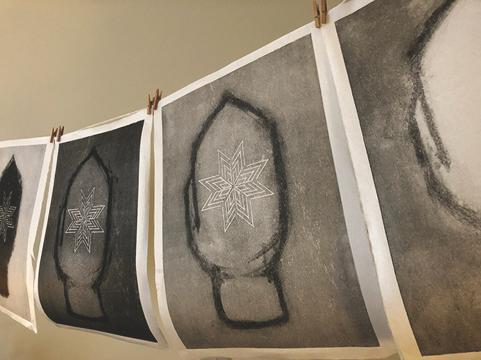
One of the most iconic Norwegian symbols has to be the Selburose.
From Wikipedia: In Norwegian knitting, a selburose [ˈsèːlbʉˌruːsə]
is a knitted rose pattern in the shape of a regular octagram.
It is traditionally used for winter clothing such as the Selbu mitten (selbuvott) and sweaters.
Selburose was the design I worked with some 16 years ago as part of a project when I studied Graphic Design in Bergen.
My friend Harald studied Arabic languages at UiB and since
the project title was 'East meets West' it felt natural to collaborate
with him on the development of an alternative Selburose.
In Arabic calligraphy, the interpretation of the written word 'Allah' seems to have a rich history. It might be the fact that it is forbidden
to create a physical image of the God that resulted in an urge to decorate the name – often to a great extent.
The name Allah can be seen written in a range of decorative ways, including stylistic. The stylistic version we worked with could resemble one of the Selburose's petals, which meant that if we placed eight of them together in a pattern the similarity would be striking. This design was merely a small digital print on paper and was never shared outwidth the college or officially published.
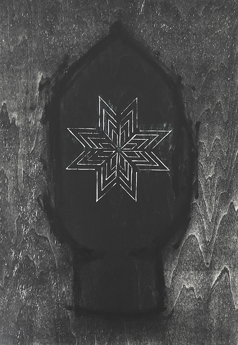
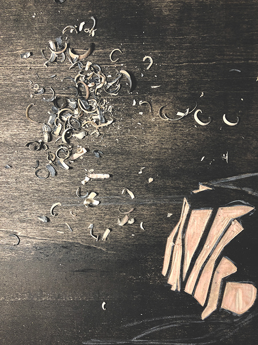
In 'norwegian-ish' I have carved the rose in a woodblock and left
the space around untouched. Then I inked up the plate and shaped
a mitten with the brayer. I've currently printed ten versions
and I might stop at this amount. For the latter four, I introduced
a brush in the monotype process. I really liked the expression
of the rough painted brush-lines, combined with the neatly carved rose with the bare wood as a backdrop. I also thought the link to
the woollen, thick mitten came through in these versions.
So what themes do I want to explore in this motif?
The fact that many will, at first glance – say that this is
without doubt, the image of a Selbuvott – I want to highlight that everything is perhaps not as it seems just by looking at the surface.
I am not saying that they're wrong, it can be a Selbuvott,
I invite all interpretations, it can be anything you want.
But remember to accommodate for other's interpretations,
because we do not see, sense or perceive things the same way.
We still though, have to learn how to live together
despite our differences, which bring us to my next point
– maybe we're not so different after all? (The answer is no.)
Image to the right shows the woodblock.
Carved, painted and inked up. Ready to become an imprint.
Carved, painted and inked up. Ready to become an imprint.
•
October 30th 2020
Dover revisited
and Teesside Print Price
Dover revisited
and Teesside Print Price
I've written about our recent day trip to Dover before,
how I was inspired to create a small woodcut depicting the white majestic cliffs.
In the weeks following after our trip, I've enjoyed working with this print, I've felt like I revisit Dover each time
I've retrieved the block, inked it up and printed it
over and over again.
Hence the working title 'Dover revisited'.
Some days its surroundings have been gloomy,
some days they are bright, some days are in fact nights, with the moon enlightening the sea, and some days are so rough yo can simply not see where the sea ends and the skies begin.
Wednesday morning, I saw Dover again, on the news
a reporter told the story of a family of five who had tried to cross the English channel in a vessel. They didn't make it.
It was with a different set of motions I slowly rolled the brayer over the white cliffs of Dover later that day
I decided to submit this wee (Scottish word for 'small') print to a competition,
the 'Teesside Print Prize', which I did today.
the 'Teesside Print Prize', which I did today.
I will keep printing editions from this woodcut,
45 to be more precise, I'm currently at 20 editions.
I could probably keep printing it forever,
but it mustn't lose its value.
The reason why this particular print fascinates me,
I think is my curiosity as to how the next print
will look like. And the next. And the next.
45 to be more precise, I'm currently at 20 editions.
I could probably keep printing it forever,
but it mustn't lose its value.
The reason why this particular print fascinates me,
I think is my curiosity as to how the next print
will look like. And the next. And the next.
The horizon changes, the skies changes, everything changes each time I make a new edition
– everything but the white cliffs.
The cliffs remain steady. Looking out onto the majestic ocean which rises and ebbs, gives and takes.
– everything but the white cliffs.
The cliffs remain steady. Looking out onto the majestic ocean which rises and ebbs, gives and takes.
•
October 23rd 2020
I made it to a London gallery!
Tuesday was opening night at espacio gallery in Shoreditch.
Although it was a 'socially distanced' event, it was a good night and a good show.
I found it slightly hard to believe that it would actually happen,
especially with London moving into tier two restrictions,
and rumours about a new lockdown potentially being imposed on us.
But no, my woodcut print 'lockgown' was there!
I thought I'd share the story behind this piece.
It was created as a response to The Artists Pool call for artists with the theme being The Resilient Self (the name of the curated exhibition).
I recently heard Grayson Perry speak on the radio with Jo Whiley and he said something that I felt resonated with how I feel about having my self-portrait on display. I did not create this piece thinking it would hang in a London gallery, nor to show off my graduation or my newly retrieved degree. However, I might not have been selected if I didn't dare to be vulnerable, and to show me.
‘You’ve got to be vulnerable. You’ve got to be prepared to make a mistake’,
was Perry’s advice when asked how to approach the art of creating.
was Perry’s advice when asked how to approach the art of creating.
I think it also resonated with how I during the last year have dared to let go
of the chase for 'the perfect' in my prints. It has become more important
to convey a message, and hopefully, it was the message I sent that got picked up,
interpreted and acknowledged.
of the chase for 'the perfect' in my prints. It has become more important
to convey a message, and hopefully, it was the message I sent that got picked up,
interpreted and acknowledged.
In addition to 'vulnerable', I do feel extremely honoured
and proud beyond anything!
and proud beyond anything!
‘lockgown’ describes how you can make things work if you have faith in your work and yourself. It’s about creating something of what you’ve got,
rather than stagnate because something didn’t go as expected.
About inventing and reinventing.
rather than stagnate because something didn’t go as expected.
About inventing and reinventing.
This black and grey print is carved from a piece of Kärhs Ash engineered wood
– a leftover plank from our house in Aberdeen, the house I’m standing in front
of in the motif. It depicts me inventing my own graduation day during
the lockdown, with a homemade cardboard hat and a cape from my national costume. My dress is scattered with a storytelling pattern where I’m the main character. My honours year was nothing like I had expected it to be, in that way it followed the template set by 2020 – the year where nothing went as expected.
But if creating a major project during lockdown learned me anything,
it was the importance of DIY
'I made it' holds many interpretations in this context.
•
October 16th 2020
What does the future hold?
No one has ever – nor will ever –be able to answer that question.
But it seems like although we're moving into stricter enforcements tomorrow
here in London, the show must go on. (I'll keep my fingers crossed anyway,
just in case).
But it seems like although we're moving into stricter enforcements tomorrow
here in London, the show must go on. (I'll keep my fingers crossed anyway,
just in case).
The show in this context is 'The Resilient Self II' where I'll exhibit my woodcut
'lockgown' at espacio gallery. I just received an uplifting message from them:
'lockgown' at espacio gallery. I just received an uplifting message from them:
We've received a number of emails regarding our upcoming exhibition.
So far, the gallery will be open, we will go ahead with the exhibition as planned.
So far, the gallery will be open, we will go ahead with the exhibition as planned.
Visit the Artists Pool website here and click on The Resilient Self II
Last Saturday we went on a day trip to Dover. It was so good to finally
be travelling again, to see the coast and breath in the sea breeze,
even wave over to France!
My relation to the white cliffs has been brought to me by the late Vera Lynn,
as I'm sure is the case for many of us.
be travelling again, to see the coast and breath in the sea breeze,
even wave over to France!
My relation to the white cliffs has been brought to me by the late Vera Lynn,
as I'm sure is the case for many of us.
The next day we went to Greenwich Market, and tucked away – almost hidden behind the stalls – was the charming little gallery Greenwich Printmakers.
They currently hold their Autumn Exhibition which can also be seen here.
They currently hold their Autumn Exhibition which can also be seen here.
These two events collided in the best possible way and sparked the inspiration to create something new.
So this week I've been working on a new woodcut with a motif from Dover.I didn't sketch too much on paper before I continued onto the woodblock.
I wanted to not get too fixated on how the shapes looked like and how
the landscape laid out in real life, but rather how these elements related
to each other on the woodblock – I wanted to treat the woodblock as a sketchbook. Surely, some shapes needed to be determined.
The white cliffs in that case are the most constant element in this context.
The land, the sea and the beach can erode and evolve, but what is a cliff? Steady.
One of the things I like about the material I work with is when you discover texture that's already there – created by nature. Woodblocks often have grains, even a chip here and there, and so had this one. A grain naturally stretched out in the wood structure and made the perfect plateau for the cliffs. In this way, the wood lent its structure to build the cliff, and the cliff lent its strength
for the plateau to rest on top of.
In a simple plywood block, four elements united – wood, earth, water and air.
I inked up the woodblock, printed onto Japanese paper, inked it up again,
in a different area, a different corner, added here, print, added there, print,
and repeat.
I really enjoyed this way of working and this will be a woodblock I'll hopefully revisit next week. That way, I'll revisit Dover, and perhaps – hopefully –
I'll also be able to bring Dover to someone else.
It's something comforting in Vera Lynn's voice when she sings
'There'll be bluebirds over
The white cliffs of Dover
Tomorrow, just you wait and see'
and in a way, I think Vera Lynn has the perfect answer to the question
What does the future hold?
just you wait and see
•
October 9th 2020
I have some great news to share!
A few weeks ago I entered an open call for artists,
hosted by The Artists Pool, called The Resilient Self II
My work – the woodcut 'Lockgown' – was a respond to this text:
A few weeks ago I entered an open call for artists,
hosted by The Artists Pool, called The Resilient Self II
My work – the woodcut 'Lockgown' – was a respond to this text:
It’s one thing to present your art honestly to the world,
it’s quite another to turn that gaze on yourself.
it’s quite another to turn that gaze on yourself.
We live in the age of the ‘selfie,’ where reality can be pushed through endless filters until every hint of vulnerability is erased.
In this show, all filters are removed as each artist presents an artwork
that gives the viewer a glimpse of their authentic self.
In this show, all filters are removed as each artist presents an artwork
that gives the viewer a glimpse of their authentic self.
We've had to spend time with ourselves during lockdown, being in one space for a long period of time, forcing us to self reflect, to uncover, discover
and explore new ways of expressing ourselves.
and explore new ways of expressing ourselves.
This exhibition is about the Self, The Resilient Self.
I was selected!
So what this means is basically that I'm going to debut as an artist – in London.
That might sound a bit pompous, but lately I've decided to stop talking down
my work, my profession, my title,
my self.
To say that it's a big deal for me to exhibit in London is an understatement.
I'm only crossing my fingers that this will actually happen (in real life, not virtually!)
as rumours of another lockdown keeps lurking around us.
I'll be picking up 'Lockgown' from the framers next Friday,
I really hope I'm pleased with the result,
as I'm very keen on finding a regular framer here in North London.
I really hope I'm pleased with the result,
as I'm very keen on finding a regular framer here in North London.
Then, next Sunday I'll head over to espacio gallery
and hang my print!
and hang my print!
Here's a little sneak peek of the print fresh out of the press.
It's a self-portrait,
carved in floorboard from our house in Aberdeen,
printed with Cranford Caligo Safe Wash,
on Vang Japanese Paper,
in September 2020
It's a self-portrait,
carved in floorboard from our house in Aberdeen,
printed with Cranford Caligo Safe Wash,
on Vang Japanese Paper,
in September 2020

•
October 2nd 2020
It's now one month since we could officially call London our home,
more specifically the north-west of London.
It's safe to say we already enjoy living here, in our wee cottage with William Morris wallpaper and a lovely conservatory which invites the outside in and allows us to
enjoy late nights under the stars without freezing or getting wet.
more specifically the north-west of London.
It's safe to say we already enjoy living here, in our wee cottage with William Morris wallpaper and a lovely conservatory which invites the outside in and allows us to
enjoy late nights under the stars without freezing or getting wet.
I've never lived in a city as big as London so I wasn't sure what to expect in terms of the busy lifestyle, noise and buzz 24/7, but you have to look for the calm in all the "business".
We find calm in the range of beautiful parks nearby, in a Zoom Yoga session in
the conservatory or simply by pulling down the curtains and cosy up in the sofa
with a movie and some dark chocolate (preferably with ginger)
– then you're simply in your living room, which could be anywhere you want it to be.
Creative wise, I've already been able to print at home here in London.
I've installed my Blueboy relief printing press and successfully printed a few woodcut prints, which (one of them) I've submitted to an open call for artists.
More about that later. I've also started working on this year's Christmas card
which is a woodcut with the current working title 'lights will guide you home'.
I'll have to find a (hopefully relatively local) supplier of blank cards, quality paper etc. and that's my mission for later today.
If only the rain could stop pouring...
Last Saturday we travelled to the opposite side of the Thames, to Southwark,
where I went to browse the specialist supplier of everything printmaking
'Intaglio Printmaker'. I bought black printmaking paper (something I haven't experience in printing onto yet), stocked up on Caligo safe wash ink, a small brayer, a spatula
and my first copy of the magazine Pressing Matters. Looking forward to getting a better overview of all the specialist art suppliers London has to offer, but Intaglio was ace!
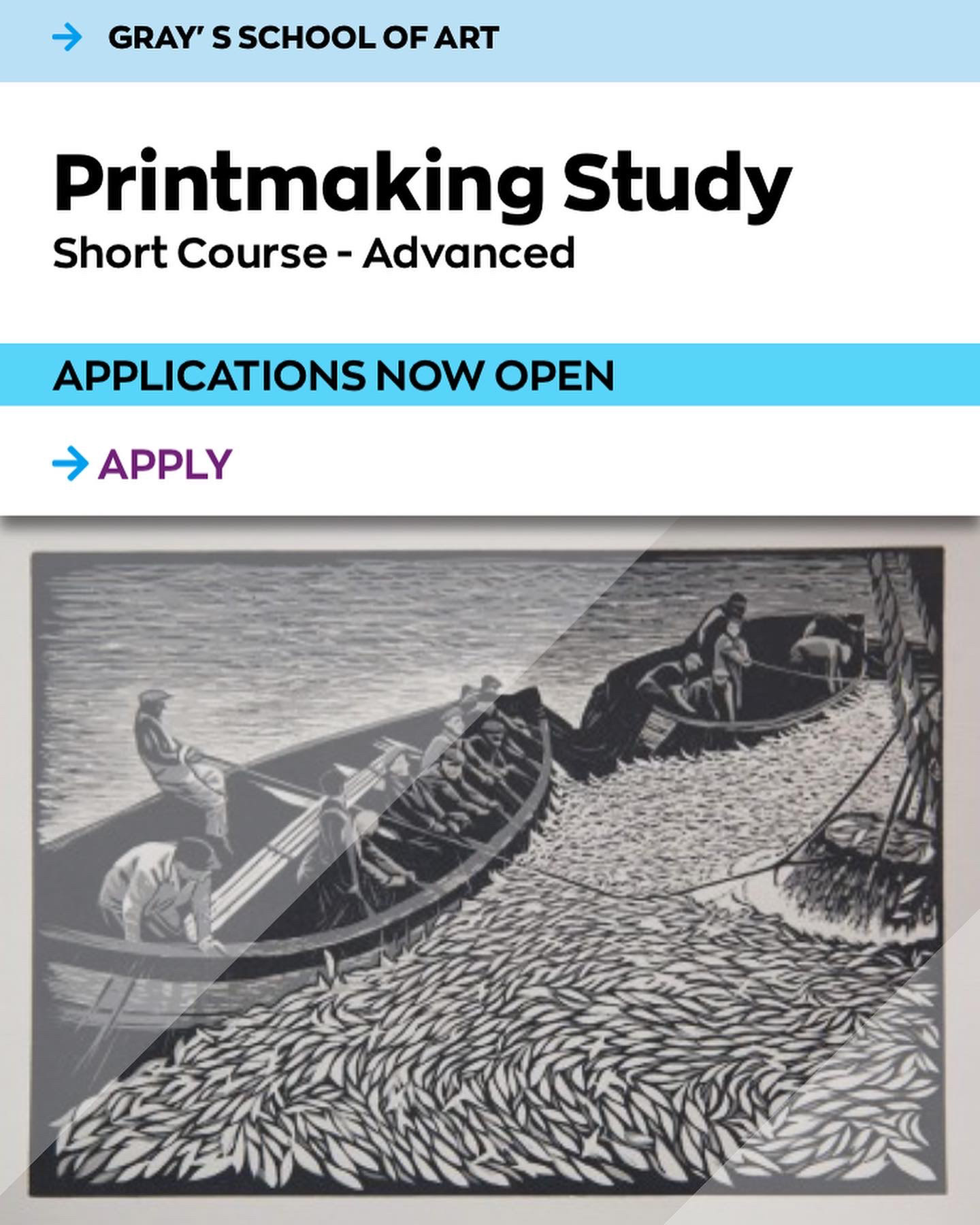
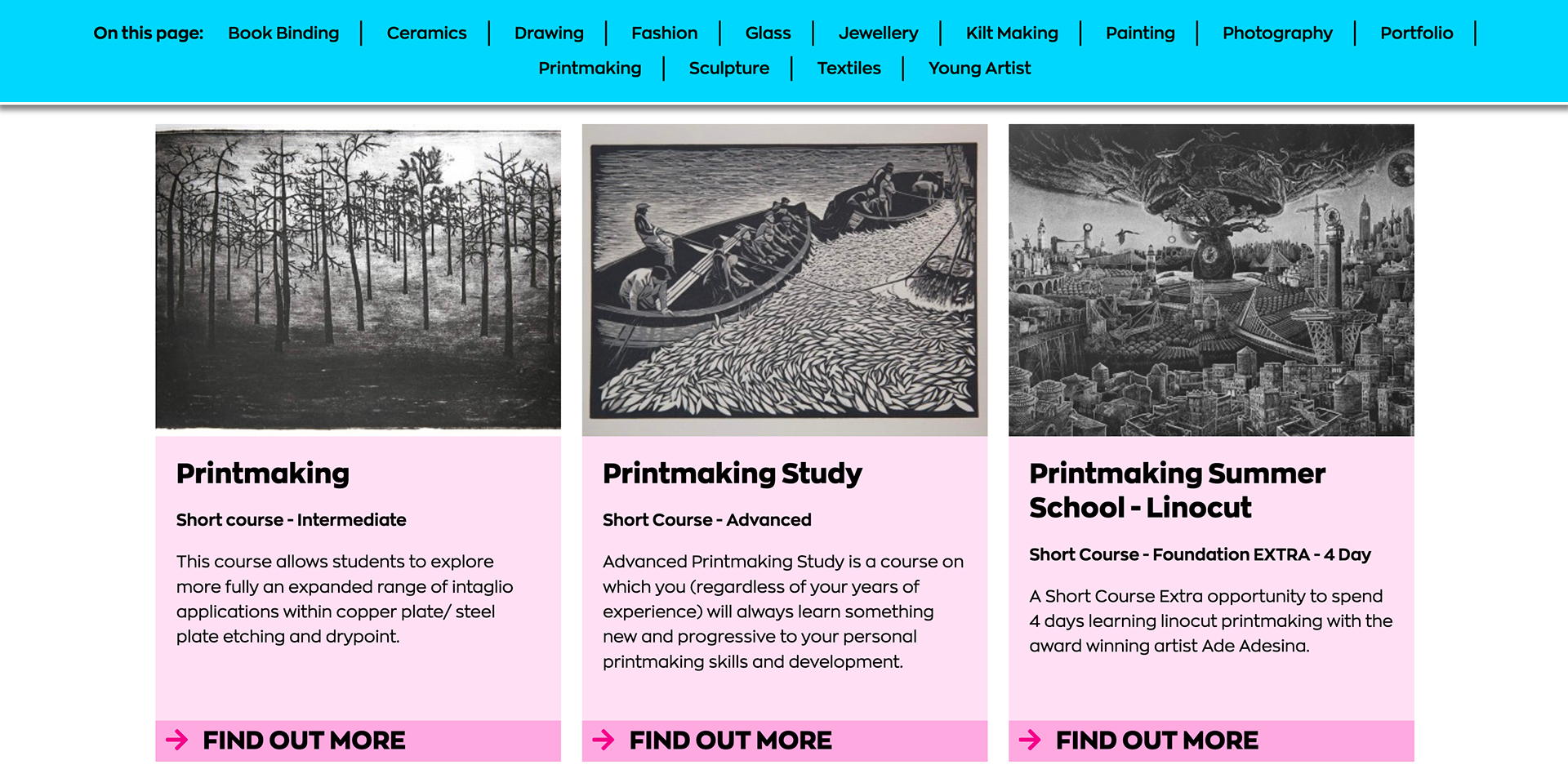
In other news, Gray's Short Courses – where I discovered my passion for printmaking –
has chosen my reduction linocut 'Sildafiskje / Herring Fishing' to front this year's Printmaking Study Advanced course (image to the right). Makes me feel very proud, especially to see my print next to the brilliant printmaker Ade Adesina! (image below).
has chosen my reduction linocut 'Sildafiskje / Herring Fishing' to front this year's Printmaking Study Advanced course (image to the right). Makes me feel very proud, especially to see my print next to the brilliant printmaker Ade Adesina! (image below).