
I studied BA (Hons) Communication Design at Gray's School of Art in Aberdeen, and as part of our final (4th) year (called Honours year) we were asked to create
one major project. The 'Honours Project'.
one major project. The 'Honours Project'.
During our third year, we were encouraged to start planning how this project was going to look like. An Honours project is a self-directed substantial piece of work,
it should preferably reflect you as the creator both in terms of the creative aspect and the theme you choose to convey through your work.
it should preferably reflect you as the creator both in terms of the creative aspect and the theme you choose to convey through your work.
I cannot remember the exact moment but – probably towards the end of
the third year – I knew I wanted to develop book illustrations for a series of books that had meant a lot to me during my past years abroad,
as a Norwegian living in Scotland.
I also knew I wanted to dedicate this last year to develop my skills in Printmaking.
It had started to dawn on me that this was the direction and profession I wanted
to pursue. I had throughout my three years of studying Communication Design moved slightly from Graphic Design and towards Illustration,
and my specific interest was now within Printmaking.
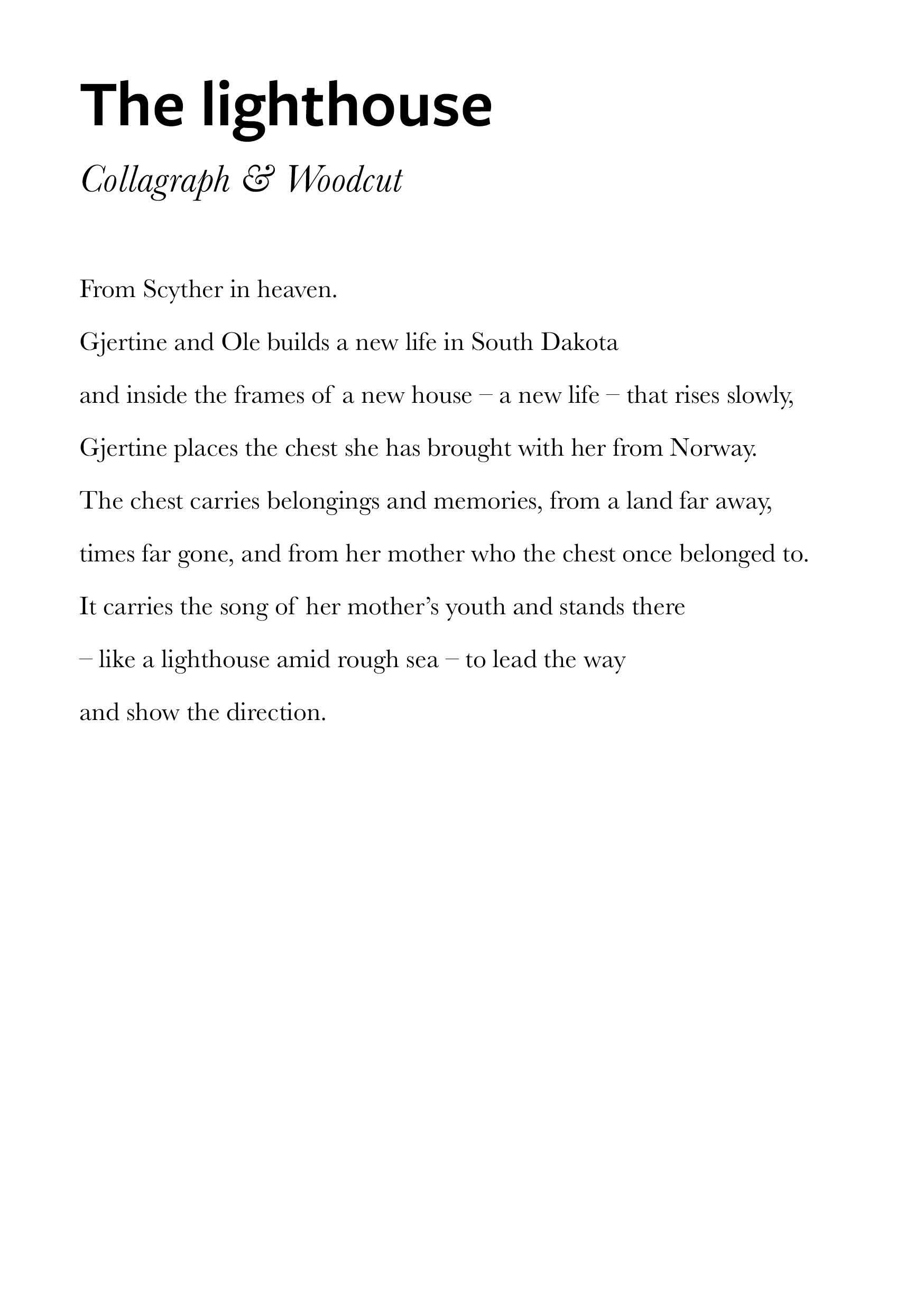
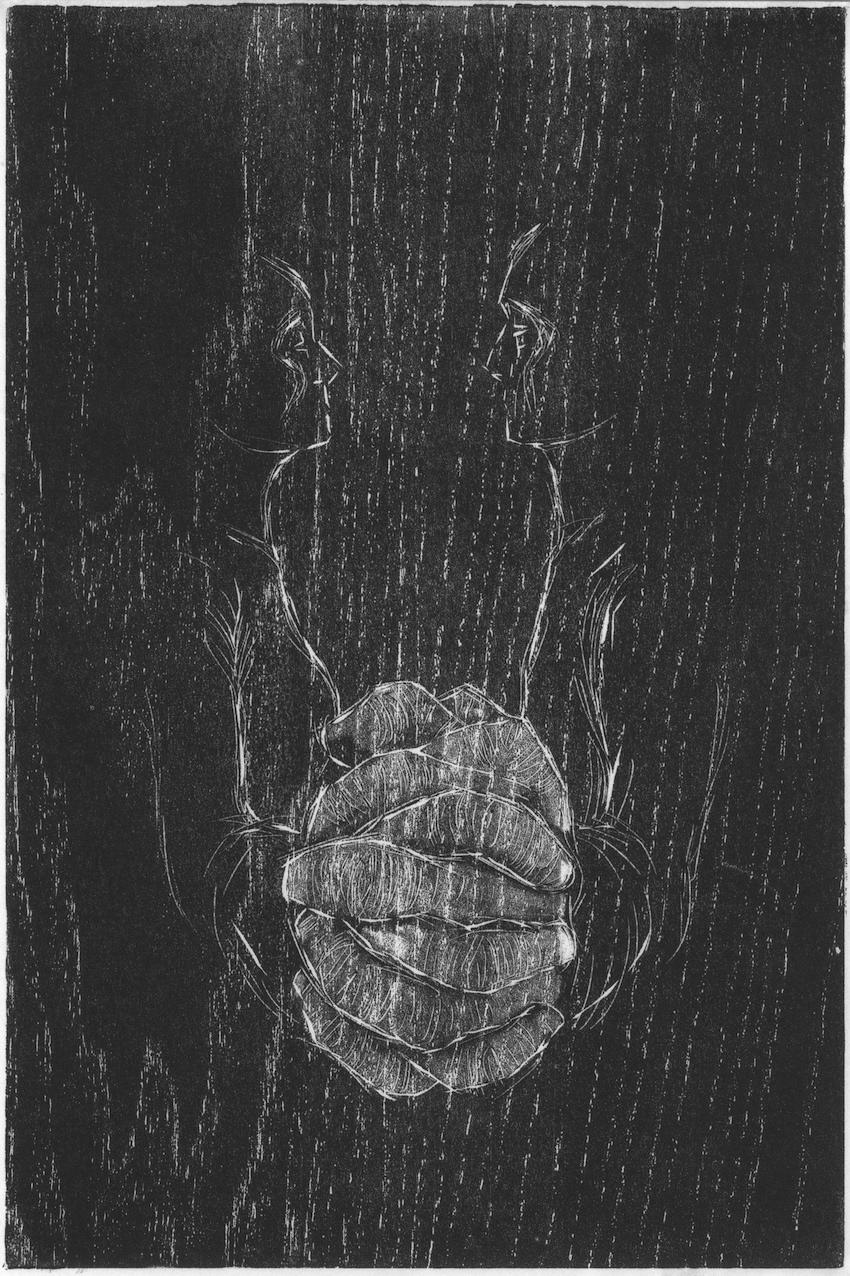
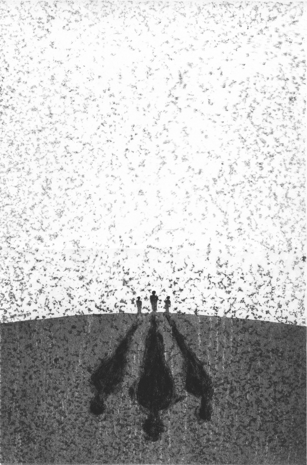
The series of books was written by one of Norway's most recognized authors, Edvard Hoem. His five books – telling the story of his own ancestors and family and their journeys from Western Norway to America, Canada, Denmark
(and for some, back again) – had captured me in a way that made me want to carry the stories further. Through to illustrations.
(and for some, back again) – had captured me in a way that made me want to carry the stories further. Through to illustrations.
I could relate to some of the stories, the people, the emotions and despair.
I knew I had to dig deeper, so I decided to seek out the source,
be where they had been, see what they had seen.
I decided to go on a research trip to Romsdal, where the written story starts.
I knew I had to dig deeper, so I decided to seek out the source,
be where they had been, see what they had seen.
I decided to go on a research trip to Romsdal, where the written story starts.
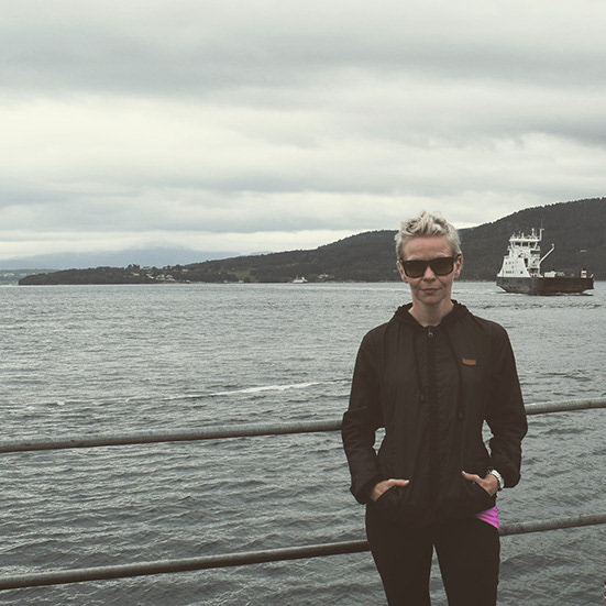
Here I am at the start of my journey to Romsdalen.
•
I started by contacting a few people connected to historical establishmets in Molde.
One of them, Ola Gjendem, was kind enough to offer me and my husband a place on a guided tour he was hosting for a group of the author's family and friends.
This 'wander in the footpath of the Scyther' became an extraordinary starting point for my research. I am forever thankful for this offer
and acknowledge the invaluable impact it made on the project.
This 'wander in the footpath of the Scyther' became an extraordinary starting point for my research. I am forever thankful for this offer
and acknowledge the invaluable impact it made on the project.
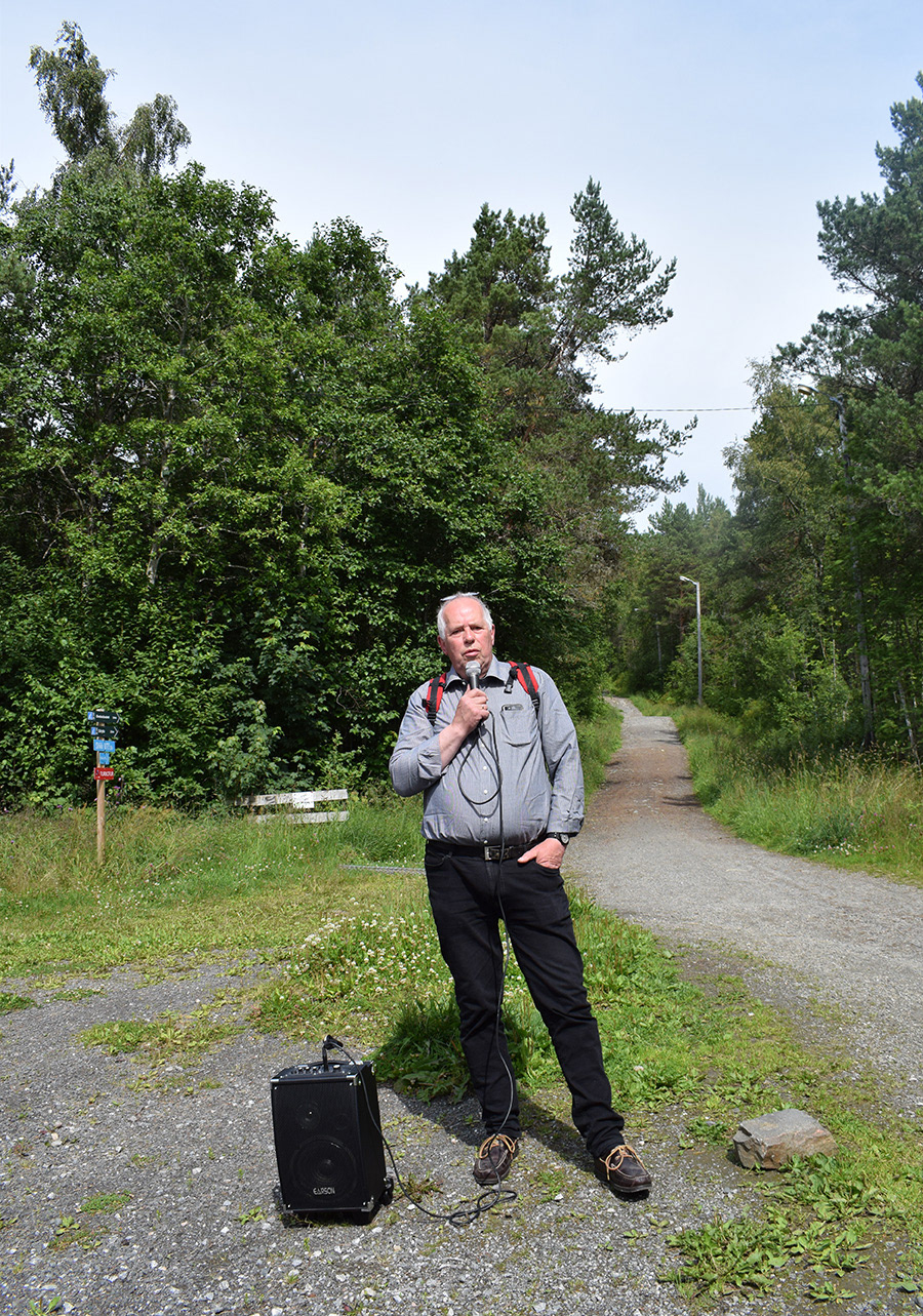
Image: Ola Gjendem proved to be an excellent tour guide
Another instance I reached out to for guidance, was the main museum in Molde 'Romsdalsmuseet'.
There, I got in touch with Mads Langnes whom
– although I did not meet in pereson in Molde –
also assisted me with my project.
A sincere thank you for his help and support.
There, I got in touch with Mads Langnes whom
– although I did not meet in pereson in Molde –
also assisted me with my project.
A sincere thank you for his help and support.
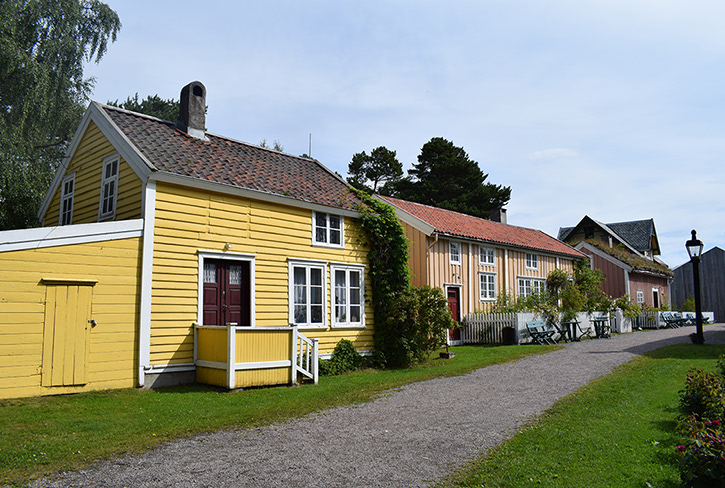
Image: Beautiful collection of houses at Romsdalsmuseet
I would also like to send a special thanks to one of the guides at the museum, Merete Halstensen, who took me on a guided tour that ended up being a private one since no one else came.
A very knowledgeable woman who contributed with a lot of historical facts to base my further work on.
A very knowledgeable woman who contributed with a lot of historical facts to base my further work on.
•
Below are the prints I created for the stories,
accompanied by my own interpretations of each image's text.
accompanied by my own interpretations of each image's text.
The book cover design (as seen in images following further down)
was created in collaboration with Alessandro Favaro.
was created in collaboration with Alessandro Favaro.
The prints
where all printed by the artist herself,
at home during lockdown,
in spring 2020 in Aberdeen, Scotland.
where all printed by the artist herself,
at home during lockdown,
in spring 2020 in Aberdeen, Scotland.
Honours Project
2019-2020
Book Illustration
Edvard Hoem's series of five books
These prints along with the texts
– all my own interpretations of Hoem's text –
were on display
in Gray's Virtual Degree show,
which took place online
with the opening night being held on
Friday the 10th of July 2020
– all my own interpretations of Hoem's text –
were on display
in Gray's Virtual Degree show,
which took place online
with the opening night being held on
Friday the 10th of July 2020


•
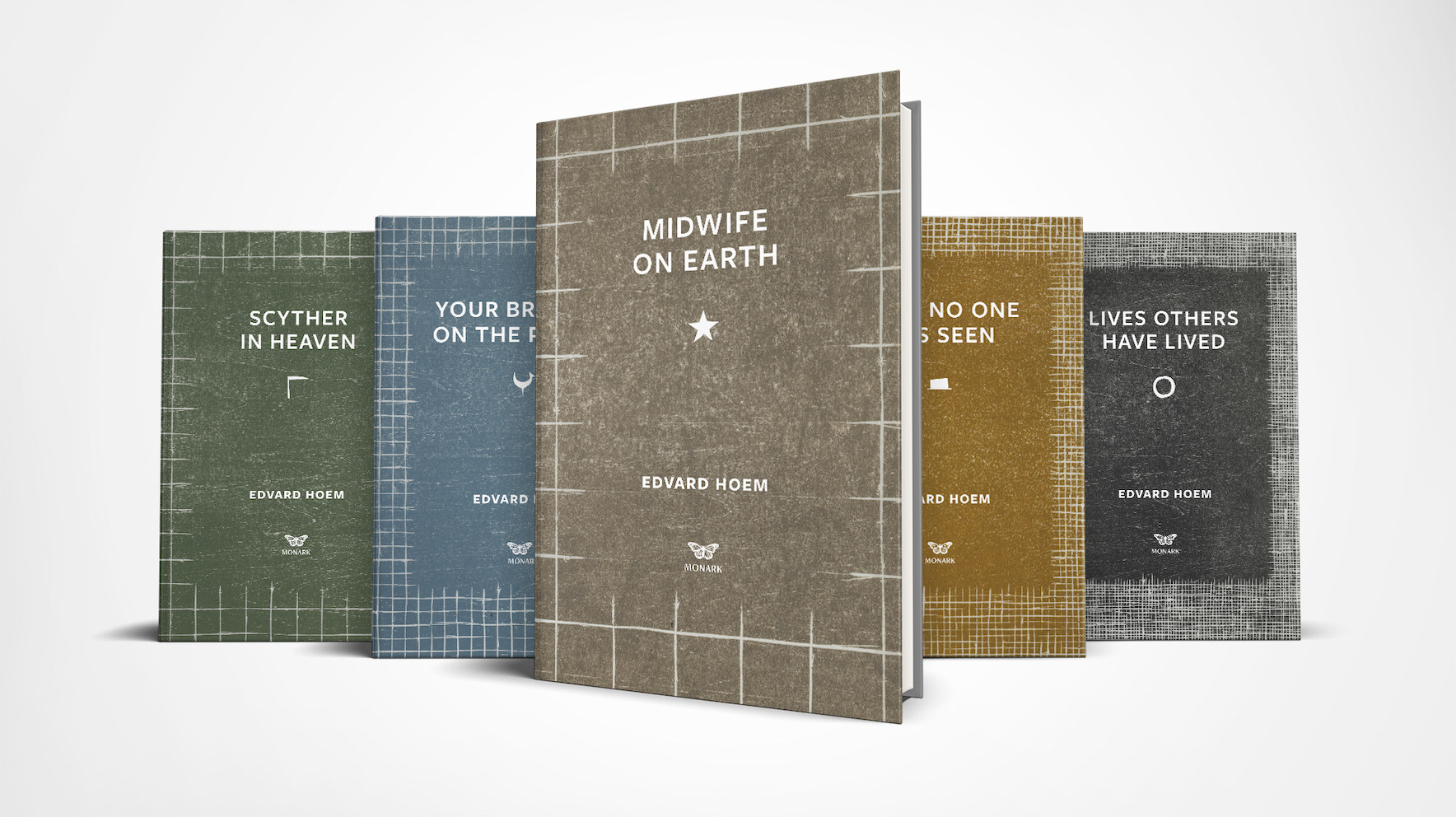
image above created by: Alessandro Favaro
The book covers
I initially had a vision about developing prints from textile fabric
for the book covers.
Although this idea evolved into working with woodcut,
the concept of the idea lived on despite the change of material.
for the book covers.
Although this idea evolved into working with woodcut,
the concept of the idea lived on despite the change of material.
I wanted to showcase that the structure of the core is the same
throughout the series of five books. It follows the generations, the stories,
the relations, yet it evolves and changes in shape slowly as time goes by.
New stories arrive, the same as new members of the family.
Frictions occur, it grows stronger in some places and weaker in some,
– even breaks in some.
The intertwined threads become more and more tightly woven.
I used the same woodblock for the five different prints,
something that emphasises on the ongoing yet evolving theme.
something that emphasises on the ongoing yet evolving theme.
For the final print, the fifth book cover,
the woodblock was exhausted, there was no room for any more lines to be carved, the wood had not anymore to give but one last imprint.
In a way, this created a very natural and nice end to the series.
the woodblock was exhausted, there was no room for any more lines to be carved, the wood had not anymore to give but one last imprint.
In a way, this created a very natural and nice end to the series.
The choice of colours
and the symbols chosen for each individual book
and the symbols chosen for each individual book
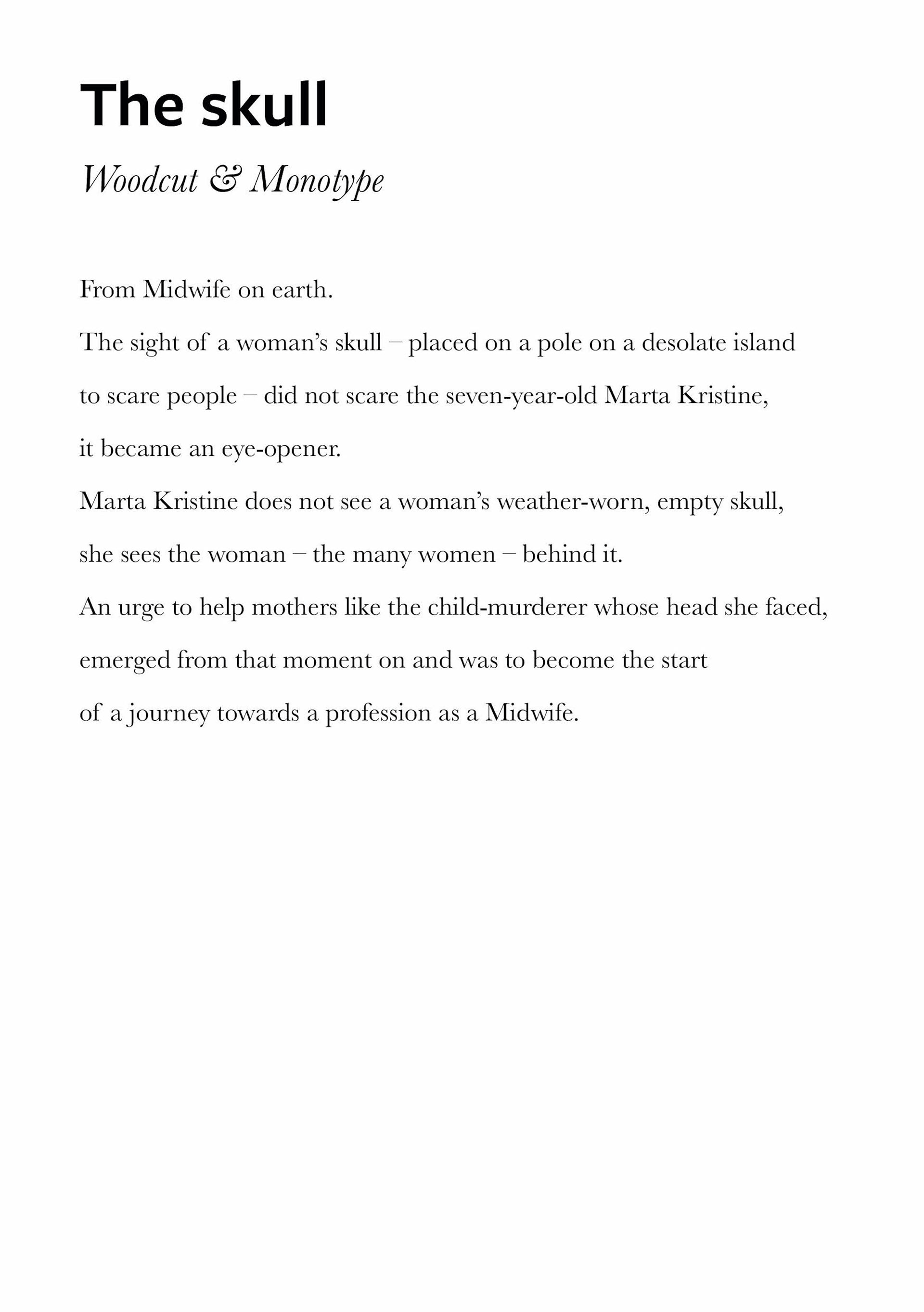
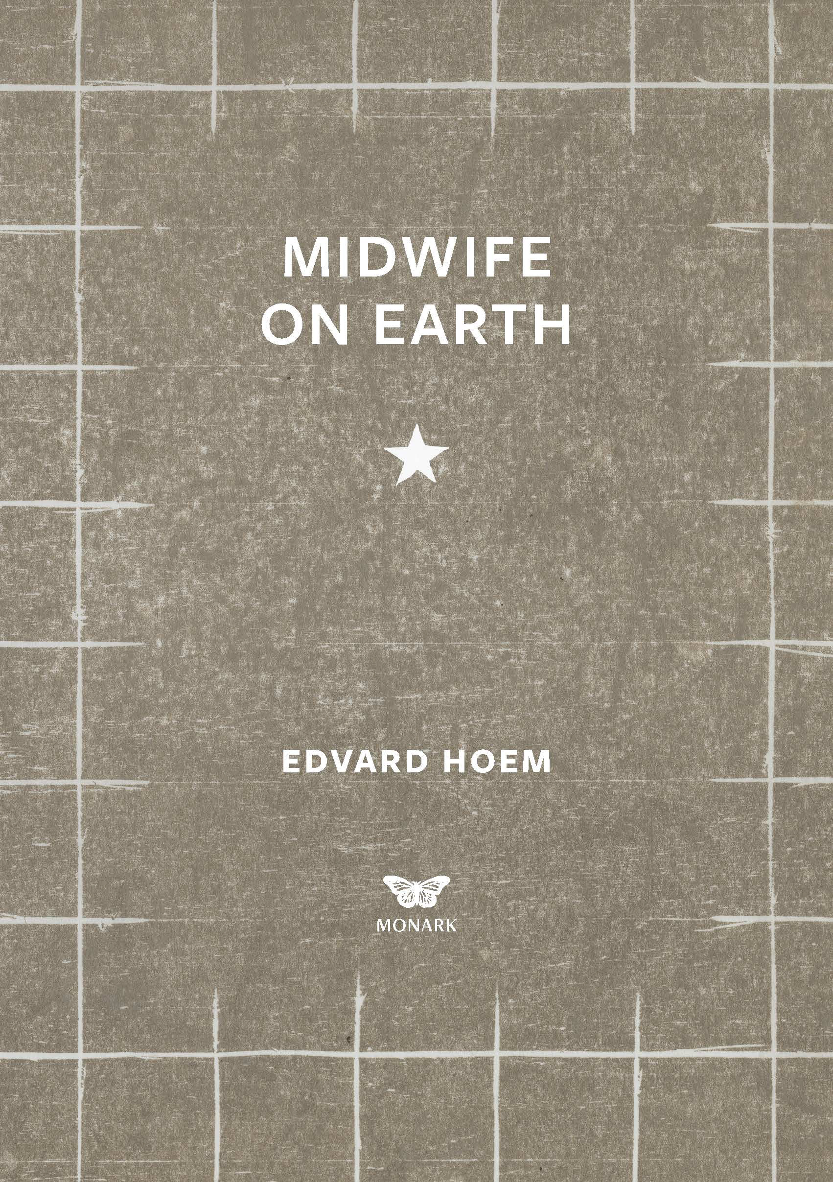
I chose to start 'my' book series with 'Midwife on Earth',
although this was in fact the last book that was published.
It made sense to me to make this the starting point beacause
it describes the somewhat 'birth of the chronicle'.
although this was in fact the last book that was published.
It made sense to me to make this the starting point beacause
it describes the somewhat 'birth of the chronicle'.
Since I initially had planned to work with fabric, the first book
was supposed to have been an imprint of a brown rough fabric,
the jute scrim.
Therefore I wanted to channel the jute scrim
when I transferred it to woodcut.
I wanted to recreate the essence of it, and I could do so with colour.
Through research I found that brown represents serious,
down-to-earth, stability, structure and support.
It relates to protection and support of family
with a keen sense of duty, responsibility
and takes its obligations seriously.
I felt this summed up the main character – the Midwife – so well,
it could not be any other colour than brown.
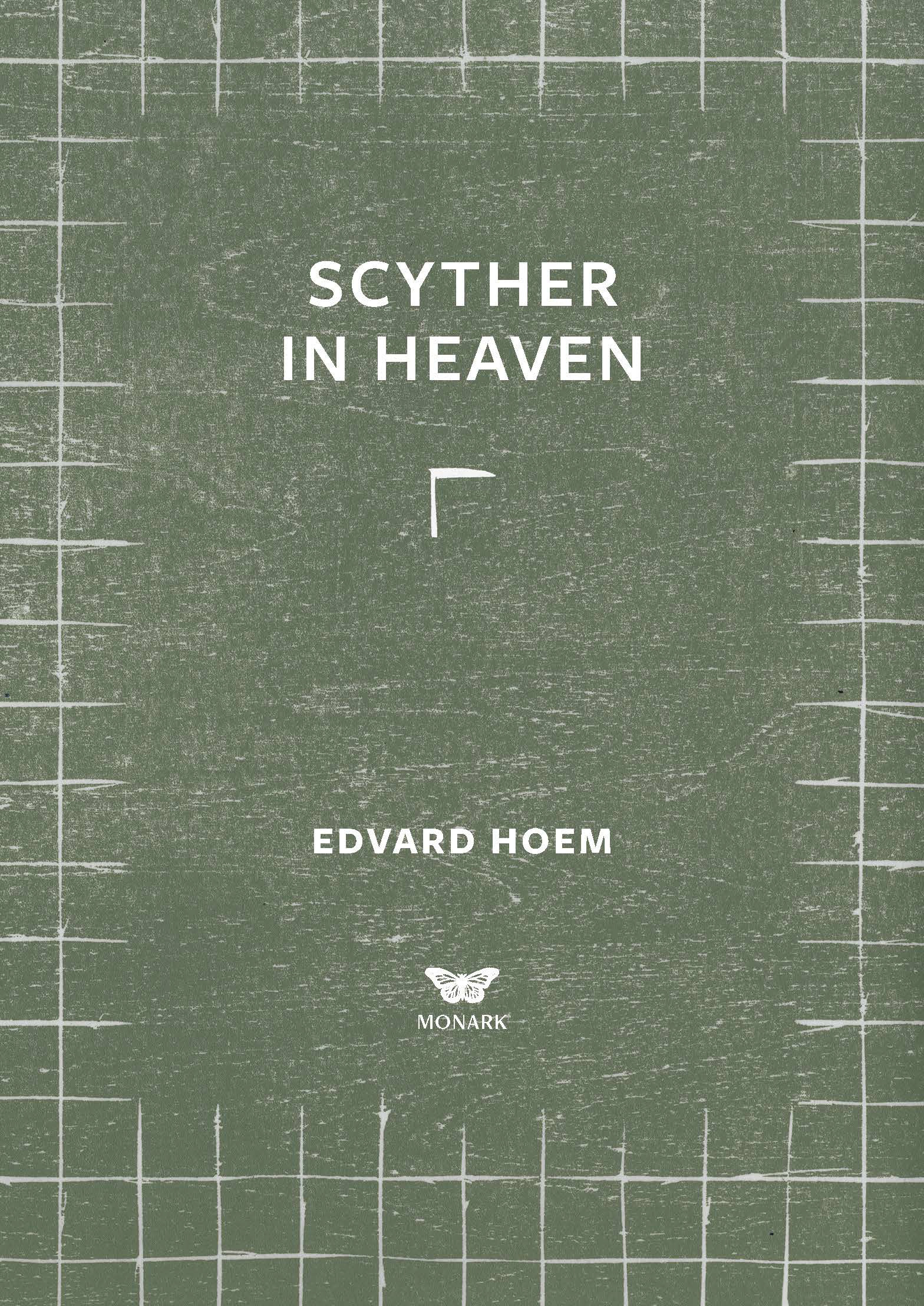
For the second book, 'Scyther in Heaven', the importance was
to describe the scyther’s life.
The scyther’s main task is to cut the grass, and therefore the time of the year associated with this is at summer – when the harvest takes place.
I chose green – a colour connected to growth – but not a bright green
which you may think of as a happy summer colour.
Imagine when you wake up early on a summer’s morning
– the sun hasn’t spread out its rays yet and there’s still dew on the grass,
making it heavy.
This is the right time to cut the grass,
and that was the sense I wanted to capture and convey.
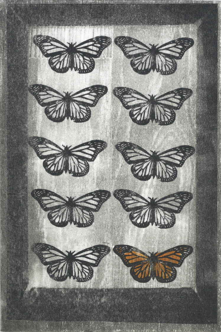
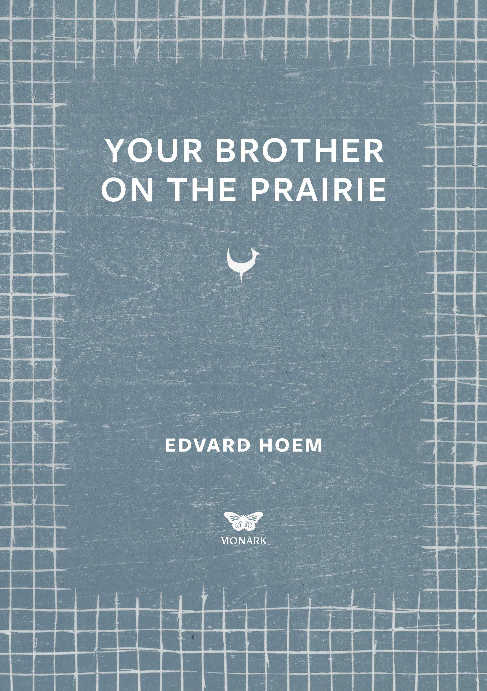
The third book 'Your brother on the prairie' is in many ways a book
of new chapters. New lives and futures are created in North America,
and though it sometimes seems extremely difficult – hopeless even – nonetheless I associate this book with hope.
Hope, new life and new beginnings.
We have a saying in Norway that 'hope is light blue'
which was one of the main reasons for choosing this colour.
According to colour psychology you can rely on blue to take control
and do the right thing in difficult times,
which to me describes Eilert who left Norway at 16 years old
and created his own path and life through America and Canada.
It exhibits an inner security and confidence,
and therefore represents Gjertine who led her family to America.
A woman who never shied away from going her own ways
and speak her own opinions.
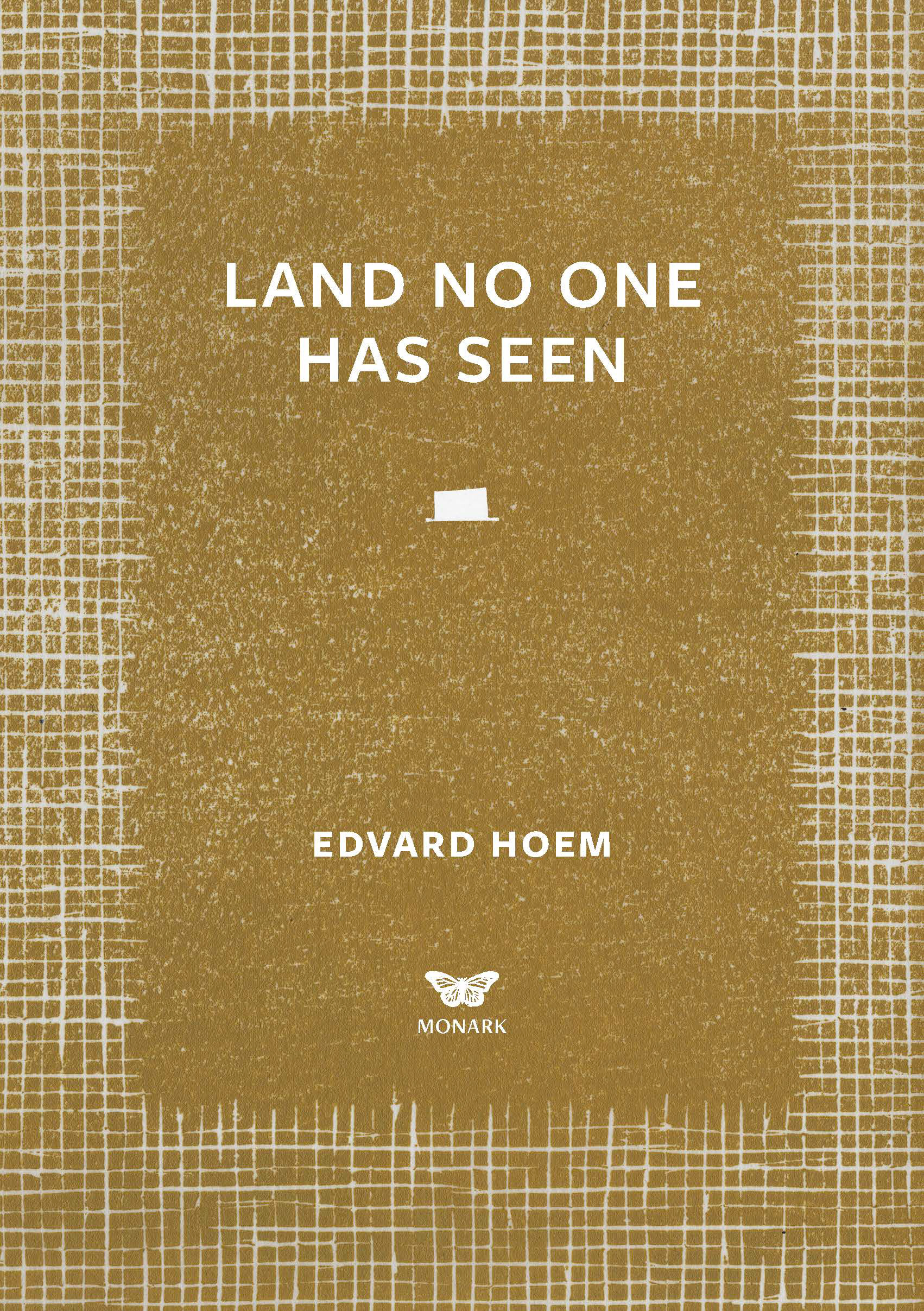
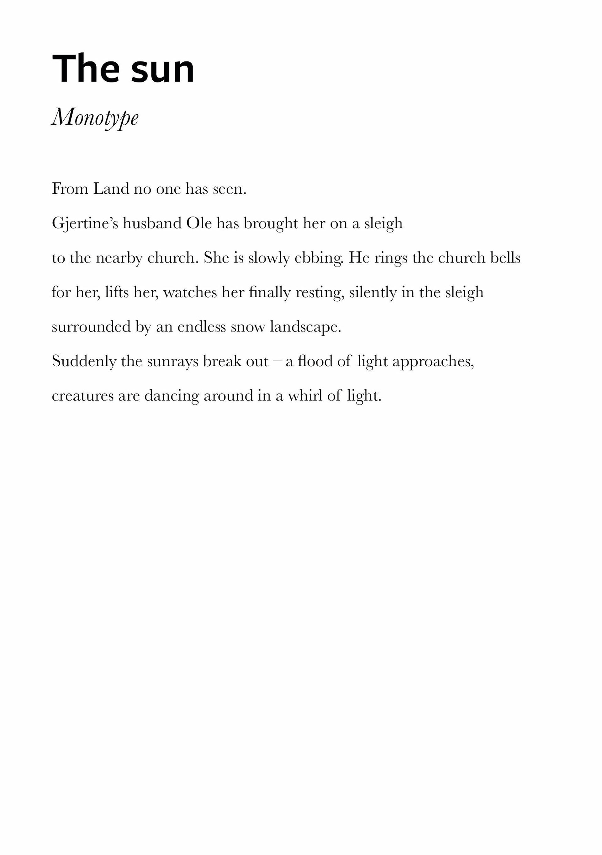
In the fourth book there is one scene which to me is so significant
I think it represents the book.
Because of this scene – where Gjertine dies,
which I have illustrated as 'The sun'
– I associate 'Land no one has seen' with both Gjertine’s death and the sun.
Death is often associated with black, however,
this was not a tragic and sad scene.
It is described as her being brought home,
and the sight (the sunrays) as a dance.
Yellow is the sun, yellow isn’t tragic,
it is uplifting and illuminating. It offers hope.
'Illuminating' is a word I would like to highlight in this sentence.
I didn’t want to choose a somewhat happy yellow,
but a more down-to-earth yellow.
The colour I mixed is an ocher or mustard yellow,
an earth colour in line with the other hues I had already created.
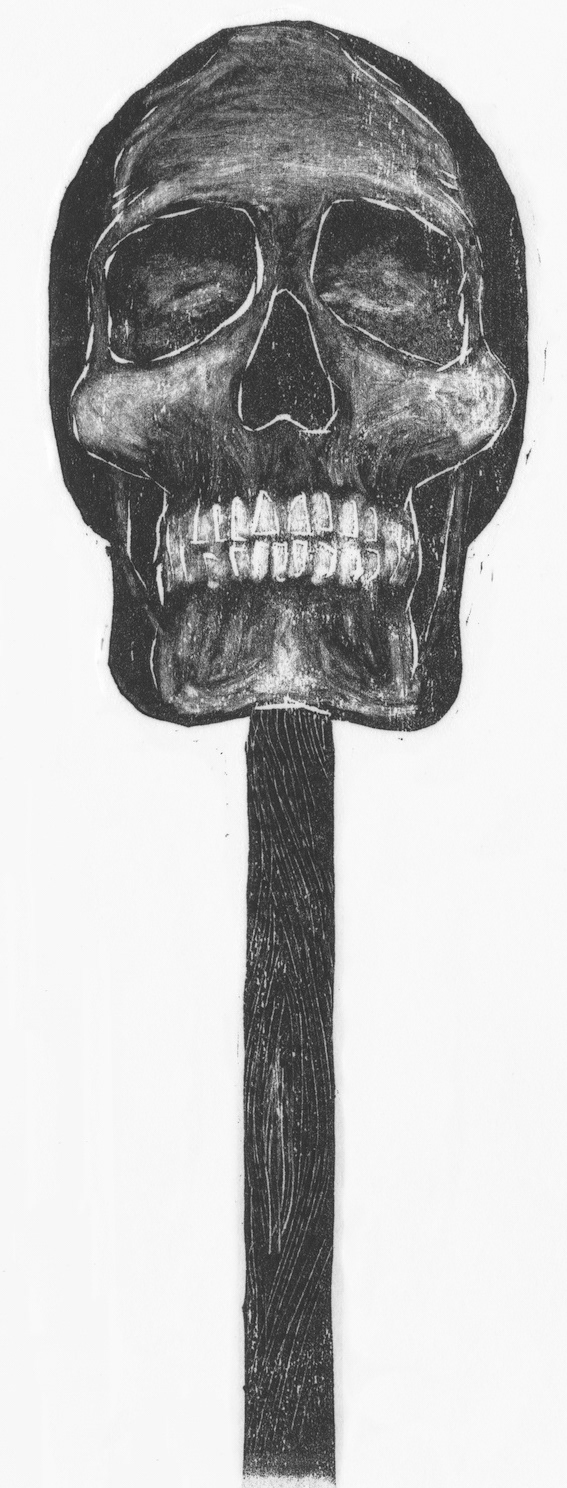
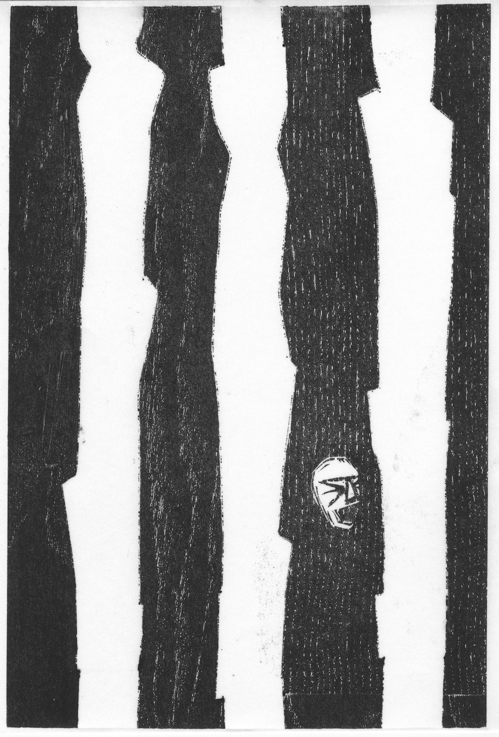
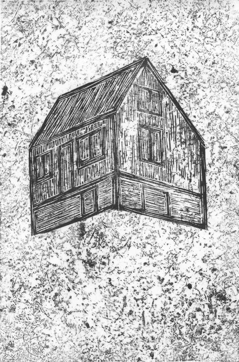
The last book, 'Lives others have lived', I associate with tragedy.
Lars is one of the main characters in this book,
he doesn’t just represent one of many who left Norway for a new life
in America, he also represents the darkness of the family.
The line of week mental health that follows the row of generations.
An inheritance you can’t remove.
The colour is dark grey, as – although some positive stories –
this book has many fateful ends.
By choosing this dark shade I also pick up the colour theme
of the illustrations I’ve created for the series
which are almost exclusively black and white.
Gray is the colour of compromise - being neither black nor white,
the transition between two non-colours.
In this last book, many loose ends are tied up, chapters and lives literally end
– it borderlines black, not white.
It’s not lively or illuminating in any way, it draws a line.
In my woodcut version, it draws many lines.
Reference for colour theory:
theory: https://www.empower-yourself-with-color-psychology.com
theory: https://www.empower-yourself-with-color-psychology.com

In addition to the colours, each book is represented by a small symbol.
The depiction of the symbols is inspired by the carvings on the Primstav.
The symbols on the Primstav would mark a significant day of the year,
e.g. the first day of winter has a mitten as its symbol,
and (coincidentally!) the 10th of July ' Knutsok' or 'Knutsmesse' (Knut's mass)
is symbolised by a scythe.
I decided the scythe as a symbol for 'Scyther in Heaven',
an asterisk as a symbol of 'Midwife on Earth',
a weathercock as a symbol of 'My brother on the Prairie',
a hat to symbolise 'Land no one has seen'
and a wreath to symbolise 'Lives others have lived'.
You can see the symbols on the book covers,
beneath the title.
beneath the title.