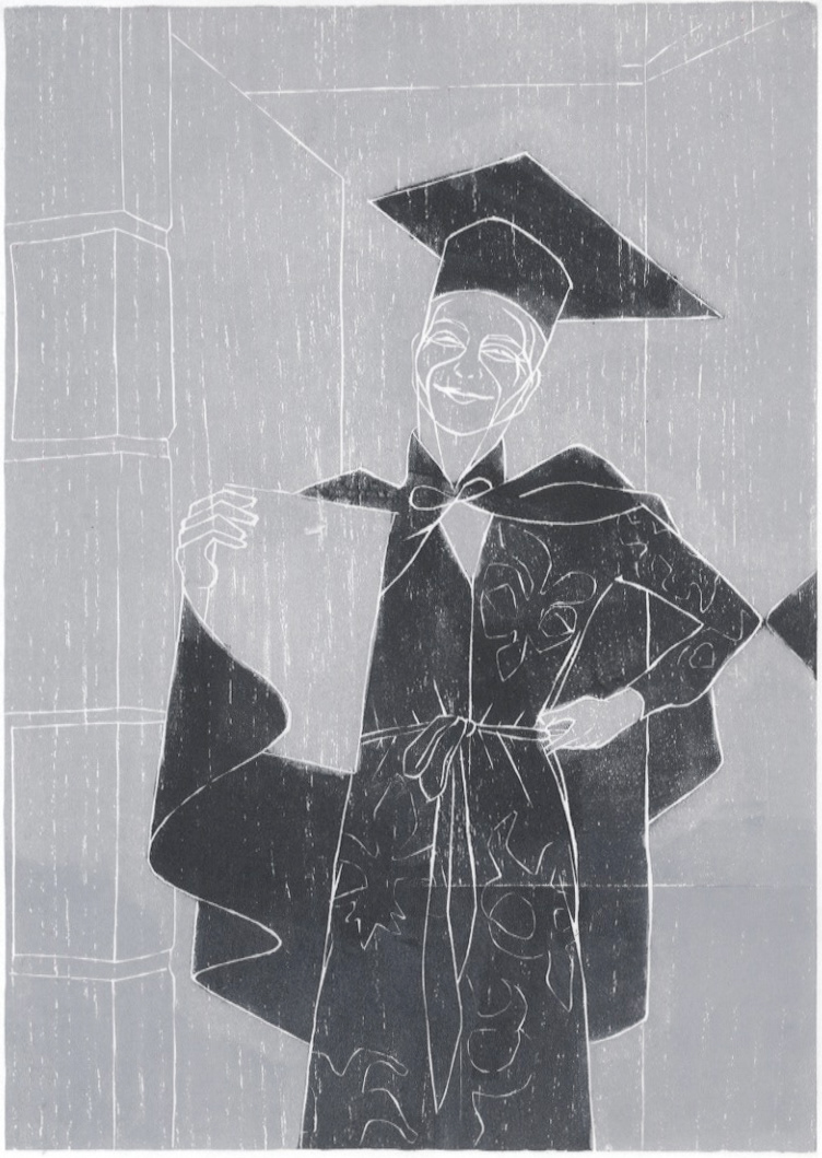
title: lockgown
technique: woodcut
created: autumn 2020
edition: 10
technique: woodcut
created: autumn 2020
edition: 10
In late summer 2020 I noticed an open call
from The Artist Pool, titled 'The Resilient Self II'.
It was the theme and the description that made me decide to enter with a woodcut I created specifically for this call.
It read:
from The Artist Pool, titled 'The Resilient Self II'.
It was the theme and the description that made me decide to enter with a woodcut I created specifically for this call.
It read:
It’s one thing to present your art honestly to the world,
it’s quite another to turn that gaze on yourself.
it’s quite another to turn that gaze on yourself.
We live in the age of the ‘selfie,’ where reality can be pushed through endless filters until every hint of vulnerability is erased. In this show, all filters are removed as each artist presents an artwork that gives the viewer a glimpse of their authentic self.
We've had to spend time with ourselves during lockdown, being in one space for a long period of time, forcing us to self reflect, to uncover, discover and explore new ways of expressing ourselves.
This exhibition is about the Self, The Resilient Self.
Along with the woodcut, I included this text in my submission:
'Lockgown' depicts me on my graduation day.
The day was not as I had anticipated and therefore followed the template set by 2020 – the year where nothing went as planned.
However, it doesn't mean it was a bad day because I had the opportunity to create it as I wanted it to be.
The same as I had with my Honours project.
If creating a major project in lockdown learned me anything, it was the importance of DIY, and so I continued with that mentality on my graduation day.
In this black and white print, you can see the graduate.
But the woodcut doesn't reveal that the hat is made out
of cardboard and that the cape is a part of my national costume. The paper I'm holding may not be a certificate
– it could be an endless list of the cooking and baking I did, recipes I created, or a map showing all the wanders
we had in Aberdeen. But it is my certificate,
I am very proud, I am wearing the cape my mother made, and at the end of the day, I was the only one who could
do it myself. I made it.'
'lockgown' was selected to be part of the group exhibition
held at espacio gallery in Shoreditch.
held at espacio gallery in Shoreditch.
I will never stop being in awe about the impact and importance
of my honours project. I’ve previously referred to it as
‘a lighthouse amid rough sea’.
It kept me going during the lockdown, kept me focused,
kept me experimenting and truly pushed me to find my own route.
of my honours project. I’ve previously referred to it as
‘a lighthouse amid rough sea’.
It kept me going during the lockdown, kept me focused,
kept me experimenting and truly pushed me to find my own route.
Equally important, I adapted a working routine I’ve never experienced before in my own practice. Yes, I had to work hard, continuously and a lot to meet the deadline, but I could probably not have done that without
the joy I found in my remote printmaking corner. Every single day I had something to look forward to. I was curious as to how I should solve
the task, eager to discover what the print of the day might look like
and what type of material to choose.
‘How would this look like when printed’ became my mantra.
I watched the sun great me in the morning by casting its rays onto
the woodblock, in acknowledgement of what I was doing.
I spent late evenings mixing ink to achieve the exact colour,
printing ‘just one more’ edition to see if I could get a different expression.
Then again, what else was there to do? Everything was closed,
everyone was locked up inside, and to be honest – that was fine by me.
I created my safe space – perhaps not so much in a physical room
as – within printmaking.
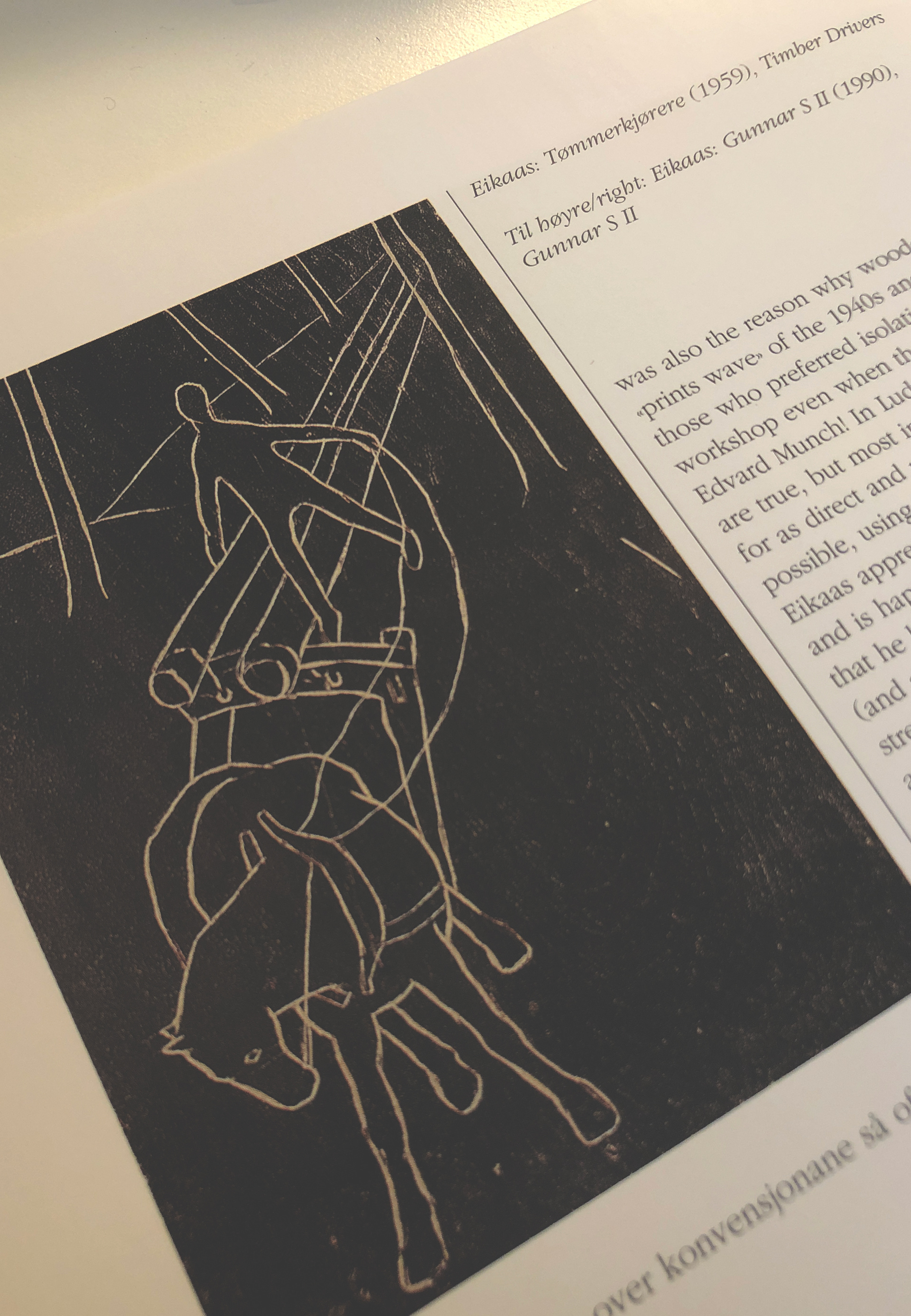
While I was working on my dissertation and doing research on Norwegian Printmakers, I came across Ludvig Eikaas who – same as Nikolai Astrup – came from Jølster and worked with woodcut, though later than Astrup.
In particular, I noticed the woodcut ’Timber Drivers’ which he debuted with at the Autumn Exhibition in Oslo in 1945. (See image right,
from 'Munch, Astrup, Nesch, Eikaas' Kristiansen 1998)
The print is made up by outlines only, simple white lines carved into
the wood and inked up with black ink, making the lines stand out.
Though the depiction is almost naive in its simplicity, it’s the dynamic
in the motif that is fascinating, the way the horse is built up by simplistic outlines, but it’s exactly what it outlines that reassures us of its strength.
There is no question as to where the power lies between these two.
However the one with the most power does not necessarily get to lead,
even though it's in lead.
I took inspiration from the expression of this print.
The white outlines were simply enough.
In my print, though I didn’t want the image to be solid black,
I wanted to create a connection to the granite city. For those who have visited Aberdeen, you may have noticed what is probably the most striking about this city. Dubbed ‘silver city’ it's entirely coloured by Granite Grey. While most of ‘lockgown’ is in grey, there was an element that needed to stand out. I could’ve easily created this as a reduction woodcut, it would probably have made the process easier. But I chose to adapt the techniques I had learned from my introduction to woodcut – Mokuhanga.
In this particular technique the ink is painted onto the woodblock with
a brush, but unlike the Mokuhanga technique where watercolour is used,
I used oil-based ink and a brayer to apply, as opposed to a brush.
After carving the lines into the woodblock (and after the usual ritual
of continuous test printing where editing appears) I inked up with a layer of grey and pulled it in the relief press. Without moving the paper completely, I carefully opened up at the bottom of the paper and added black ink onto the areas that required this – the dress and the gown –
after which I did the same with the top end of the paper and added
to the hat. This process included some trials before I found the expression
I wanted to go with, which was to add black ink, then carefully remove
the ink out-width the white lines with cotton buds.
I then pulled it a second time and checked carefully whether I had to be added more ink, but without removing the paper as this would destroy
the registration of the two layers.
As I mentioned, the woodblock I have carved isn’t just any woodblock.
Throughout the recent year, I have developed a fascination for material
and entered an ongoing search to connect material or object to the product itself – which is often in this context – the print.
This can be best described in my reduction woodcut Lilla.
This fascination combined with the DIY mentality – I had to use what I had there and then rather than look for costly and ordered solutions during the lockdown – made the decision of using a piece of Kährs’ Ash engineered wood easy.
The story behind this piece of wood lies in Aberdeen, literally in our previous house in Burns Road. After purchasing this granite house
we redecorated and laid out new floorboards in the living room area.
The leftover planks proved to be excellent to use in printmaking.
The smooth and polished surface was first of all very solid,
which meant it can be quite laborious to carve but at the same time it holds the ink very well when inked up. More interestingly I found that I could manipulate the ink on the surface after applying it – in a much better way
then when I worked with plywood, where the porous surface won’t transfer the same amount of details onto its imprint.
‘lockgown’ is therefore a depiction of me standing in front of our granite house (affectionately dubbed ScanDeen) created in a piece of floorboard retrieved from the house itself. The originality of the Kährs Ash wood being Swedish also adds to the Scandinavian Connection.
My honours year also saw me utilise symbolism in my work,
which is also the case in lockgown. The perhaps most obvious
– and what I’ve also discussed above – is the connection to Aberdeen, seen in the choice of colour, the connection to the material used
and the granite wall on the left.
If you look at the print as a map, the granite is facing in the west direction
– the same as Scotland, where Norway would then be in the east direction.
On the opposite wall, a reflection of my arm can be see – my elbow –
the only hint I have given to the ongoing pandemic or lockdown situation
we were in when this event was taking place. It discusses the lack of social and physical contact during this period. The fact that it is in the east direction, might hint to where these issues were the hardest to tackle
and experience when we went on a somewhat impulsive trip to Norway during the summer.
Norway is also represented in my cape, together with themes such as family, inheritance, tradition and handcraft. In real life, this black cape
with a silver brooch and red lining is a part of my national costume
made by my mother. After writing an essay about Craft with focus on
the Norwegian national costume ‘Bunad’ I retrieved a deeper understanding and respect for objects handmade by someone close
to you. In a way, these objects can act like tokens or reminders,
and might therefore add more value in affection regardless of its
economic value.
My black dress has white patterns in reality, though not the ones seen
in this print. The oddly shaped ornaments are all different interpretations of the ‘fleur-de-lis’ lily and they all tell a certain story or show a side of me. It’s important to notice that the dress isn’t covered in this pattern – yet.
in this print. The oddly shaped ornaments are all different interpretations of the ‘fleur-de-lis’ lily and they all tell a certain story or show a side of me. It’s important to notice that the dress isn’t covered in this pattern – yet.
The Resilient Self II was on show at espacio gallery, 159 Bethnal Green Road, London, E2 7DG, from Tuesday 20th to Sunday 25th October 2020