title: Norwegian-ish
technique: monotype combined with woodcut
edition: n/a hence the use of monotype
created: autumn/winter 2020
size: 20 X 28 cm
technique: monotype combined with woodcut
edition: n/a hence the use of monotype
created: autumn/winter 2020
size: 20 X 28 cm
These prints are based on a design I developed about 16 years ago, combined with new ideas.
They are created with the combination of one constant element, together with shifting elements. The woodcut is the element
that ties these prints together and makes them into 'sister-prints'.
The use of monotype is what makes each one of them unique.
These two techniques represent something unifying
and something separating, respectively.
that ties these prints together and makes them into 'sister-prints'.
The use of monotype is what makes each one of them unique.
These two techniques represent something unifying
and something separating, respectively.
I worked with and developed this combination during my Honours project,
when I found this site useful:
read this if you want to learn more about monotype.
when I found this site useful:
read this if you want to learn more about monotype.
Many might see a traditional Norwegian knitted Selbu mitten
in this print, but in fact the pattern reads ‘Allah’ written in Arabic Kufic Style. Therefore it challenges our perception of objects
and images, often grounded in our culture.
in this print, but in fact the pattern reads ‘Allah’ written in Arabic Kufic Style. Therefore it challenges our perception of objects
and images, often grounded in our culture.
Lately, I've embraced the freedom of being able to come up with ideas and transfer them into something more concrete
– more rapidly than before.
Where I've previously had to produce a certain set of proof which involved research, sketches, developments, feedback etc.
for the last three years or so, I can now choose to go straight to the core of the creating process.
That being said, I understand and appreciate the importance
and the impact a good development-process has on the outcome, I think I just need to give myself a break from the exhausting part of it. My work mode need some freedom, less restriction,
space to explore what it is,
on its own.
This way of working perhaps also allows for ideas to flow easier,
to open up for extern inspiration. At least these prints are good examples that influence from different areas can collide in the same space of time and be projected into an idea.
I can't say for sure which one came first, but for me,
there were three factors of influence that made me retrieve
the mentioned pre-made design.
These were: the marking of the first winter day,
the 14th of October, which according to the Norwegian Primstav would be symbolised by a mitten. Ergo a very traditional Norwegian symbol.
Read about the primstav here.
Then there was a series on NRK, about three Norwegian
young adults, all with multicultural backgrounds
and the challenges they were faced with.
It tackles how you might not feel like you fit into any of
the cultural groups you're 'supposed to' fit into
and perhaps also an underlying theme that you should never judge a book by its covers,
and sometimes things aren't how you might initially perceive it.
Which is a theme I'd like to emphasise in this context.
Read about Norsk-ish here.
The last influence came from Rawdah. A young Muslim woman who features in a docu-series about her modeling career by NRK. Her bravery and resilience made an impact on me and I felt proud to say I'm from the same country as Rawda. She is the best example of 'dare to stand out of the crowd' I've seen for a long time, and I bet she is a pioneer and role model
– not only for other Muslim women – but for women who may want to go their own way. Read about Rawdah Mohamed in Vogue.
One of the most iconic Norwegian symbols has to be
the Selburose.
From Wikipedia: In Norwegian knitting, a selburose [ˈsèːlbʉˌruːsə]
is a knitted rose pattern in the shape of a regular octagram.
It is traditionally used for winter clothing such as the Selbu mitten (selbuvott) and sweaters.
Selburose was the design I worked with some 16 years ago as part of a project when I studied Graphic Design in Bergen.
My friend Harald studied Arabic languages at UiB and since
the project title was 'East meets West' it felt natural to collaborate
with him on the development of an alternative Selburose.
In Arabic calligraphy, the interpretation of the written word 'Allah' seems to have a rich history. It might be the fact that it is forbidden to create a physical image of the God that resulted in
an urge to decorate the name – often to a great extent.
The name Allah can be seen written in a range of decorative ways, including stylistic. The stylistic version – Kufic Style – we worked with could resemble one of the Selburose's petals, which meant that if we placed eight of them together in a pattern the similarity would be striking.
This design was merely a small digital print on paper and was never shared outwidth the college or officially published.
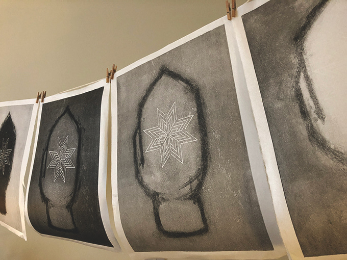
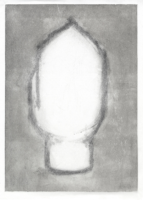
In 'Norwegian-ish' I have carved the rose in a woodblock and left
the space around untouched by any sharp tools.
Then I inked up the plate and shaped a mitten with the brayer.
I've currently printed ten versions and I may or may not stop at this amount. For the latter four, I introduced a brush in the monotype process. I really liked the expression of the rough painted brush-lines, combined with the neatly carved rose with the bare wood as a backdrop. I also thought the link to the woollen, thick mitten came through in these versions.
So what themes do I want to explore in this motif?
The fact that many will, at first glance – say that this is
without doubt, the image of a Selbuvott – I want to highlight that everything is perhaps not as it seems just by looking at the surface.
The fact that many will, at first glance – say that this is
without doubt, the image of a Selbuvott – I want to highlight that everything is perhaps not as it seems just by looking at the surface.
I am not saying that they're wrong, it can be a Selbuvott,
I invite all interpretations, it can be anything you want.
But remember to accommodate for other's interpretations,
because we do not see, sense or perceive things the same way.
We still though, have to learn how to live together
despite our differences, which bring us to my next point
– maybe we're not so different after all? (The answer is no.)